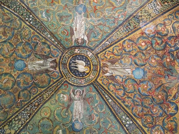
mosaic, public-art
#
public art
#
mosaic
#
public-art
#
tile art
#
geometric
#
decorative-art
Copyright: Public domain
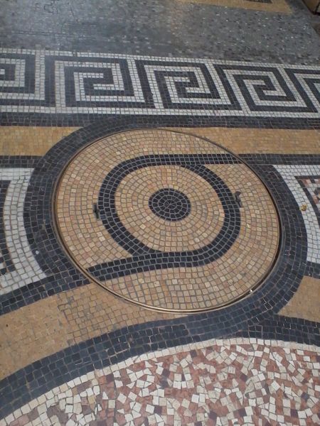
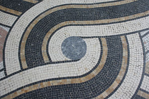
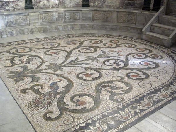
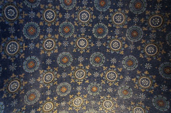
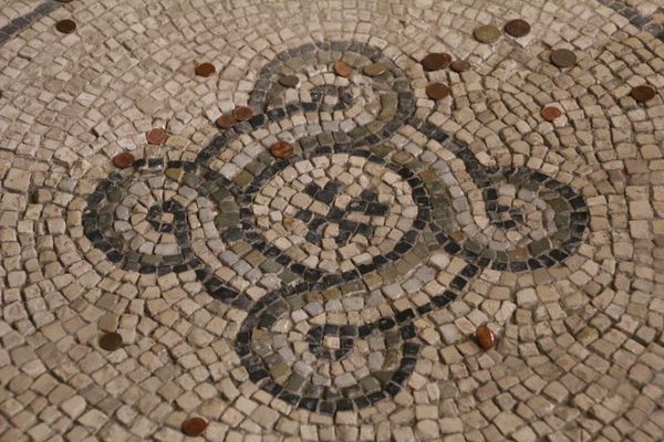
Editor: Here we have what looks like mosaic tile art by Giandomenico Facchina titled "Galerie Vivienne." It's quite captivating and looks like something you might find on the floor of an old building. The central design uses strong geometric forms, particularly circles and starbursts. What do you notice in this piece? Curator: The composition is a complex interplay of geometric shapes and varying tesserae. Note how the artist creates a subtle rhythm through the placement of the differently hued tiles. This variation disrupts the severity often associated with pure geometry. Editor: So the disruption is intentional? To soften the starkness? Curator: Precisely. The composition avoids stagnancy; the eye is drawn across the design as it seeks patterns. Do you perceive how the palette choice, of primarily muted earth tones, contrasts with the sharp lines of the star motif? Editor: Yes, now that you mention it, the colours almost feel grounding, or comforting, set against that bolder shape. Curator: The artist utilizes contrasting color temperatures and mosaic size to draw your eyes towards that visual focus. The geometric forms, tessellated in this specific way, allow for exploration and close visual study of patterns. Does that alter your first perception? Editor: Absolutely. I initially saw just an overall pleasing design, but I understand better now the contrasting elements and subtle sophistication in it. Thank you. Curator: It’s these elements – colour, tesserae size, geometric interplay – that give this mosaic depth beyond its immediate aesthetic charm.
Comments
No comments
Be the first to comment and join the conversation on the ultimate creative platform.
More like this