Dimensions: height 421 mm, width 344 mm
Copyright: Rijks Museum: Open Domain
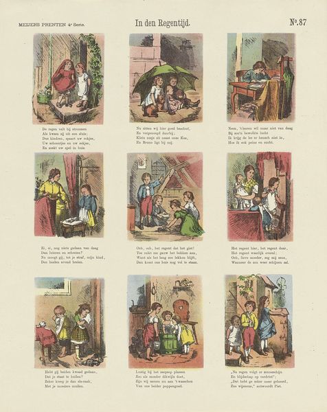
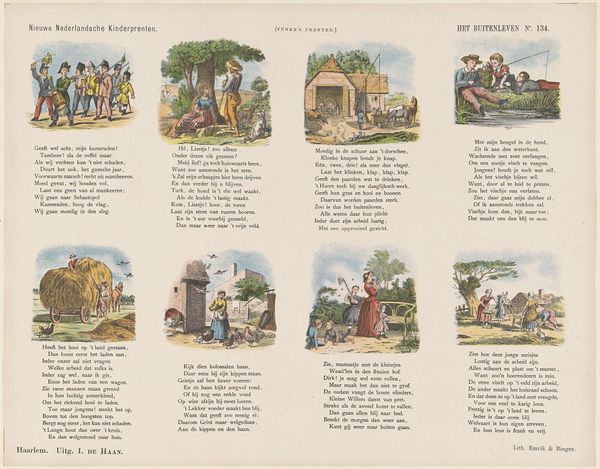
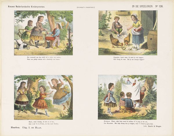
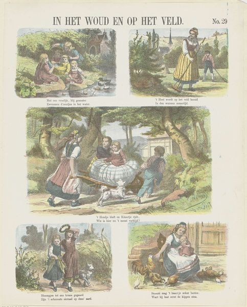
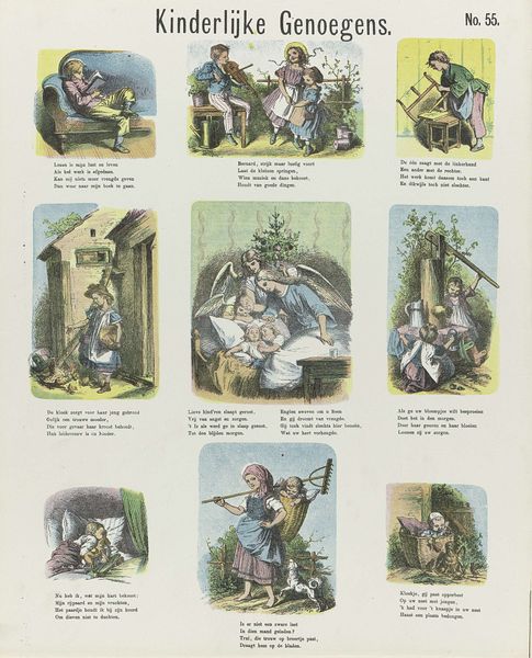
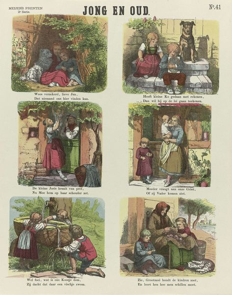
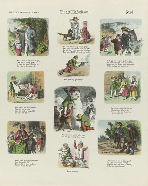
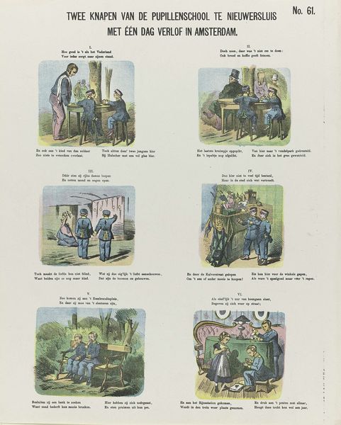
Editor: This artwork, "In den Zomer," created in 1878, uses lithography as a medium to depict a series of summer scenes. I find the compartmentalized compositions and simple lines oddly charming. How would you approach understanding this piece? Curator: The lithographic process is key. Consider how the artist's labor shapes this print – the grinding of the stone, the careful layering of inks, the repeated impressions made for mass distribution. What was the cost of these materials? And who could afford to buy it? Editor: I hadn't considered the material process of printmaking. It makes me think of this less as a fine art piece, and more like a widely distributed narrative, possibly for educational or decorative purposes? Curator: Exactly. And how does the choice of imagery relate to the intended audience and its cultural moment? Romanticised depictions of children experiencing an idealized summer landscape might also mask a less rosy reality. For example, what commentary can you extract by evaluating the absence of the laboring class in the prints? Editor: I guess these scenes leave out the realities of agricultural work and industry from the era, only presenting pleasant imagery that romanticizes childhood in a selective way. Perhaps it served to reinforce specific values or social hierarchies? Curator: Precisely. Think about the source of the paper and inks – who produced them, under what conditions? The consumption of even an seemingly innocuous artwork is deeply embedded in socio-economic processes. Editor: I see what you mean! By analyzing the materials and production, we uncover a deeper story about consumption, class, and even the values that are being promoted through something as simple as a children’s print. Thanks! Curator: Yes, understanding the 'what' and the 'how' always informs the 'why'. I learned something new too.
Comments
No comments
Be the first to comment and join the conversation on the ultimate creative platform.