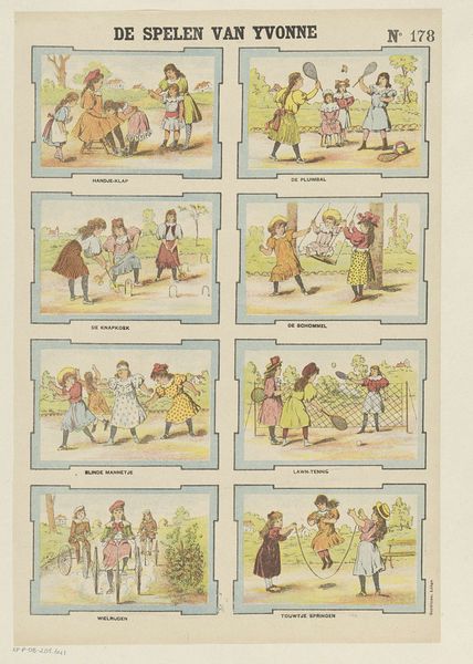
#
narrative-art
# print
#
folk-art
#
genre-painting
Dimensions: height 399 mm, width 295 mm
Copyright: Rijks Museum: Open Domain
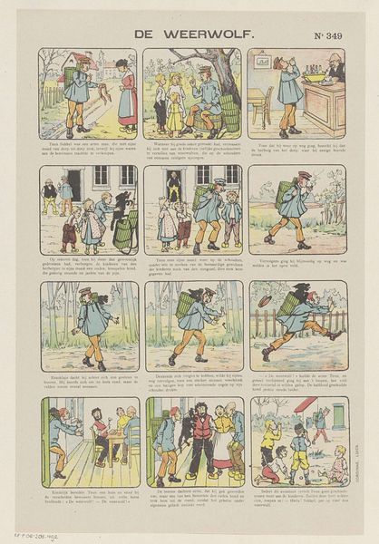
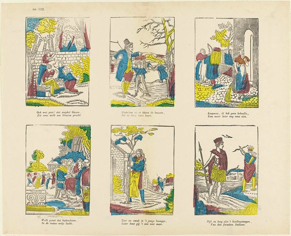
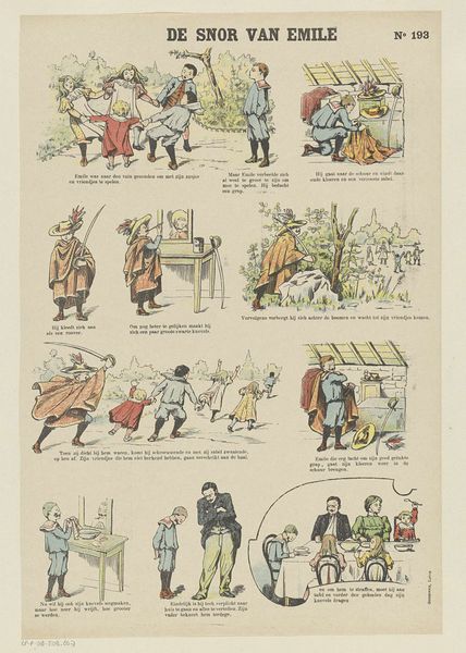
Curator: Before us we have a lithograph titled "Een benauwde Droom," or "A Distressing Dream," printed sometime between 1869 and 1888. What strikes you immediately about this Dutch print? Editor: The layout—almost like a comic strip—gives the piece an air of charming simplicity, though the tonal range feels somewhat restricted; largely pale hues, punctuated with swathes of red. The narrative thread seems… sinister. Curator: Precisely. Consider how the artist, J.H. van Wees, organizes the narrative. Each vignette presents a progression: Children frolic, they’re separated, a menacing wolf appears—culminating in a scene of maternal comfort. We can see how Wees masterfully employs spatial relations within each individual frame to drive the emotional impact of each sequential tableau. The limited color palette works by accentuating that crimson, a marker of impending doom in that green forest. Editor: That wolf’s sudden appearance—the stark black against the otherwise pastel tones—feels quite heavy handed to me. I immediately think about anxieties surrounding childhood innocence and protection, especially the perceived dangers of the "natural" world. Wolves as symbolic aggressors against feminine vulnerability have a very long history. How do we read into the gendering of these figures here? Curator: A fine observation! Semiotically, red acts as an intentional lure for the eye—establishing and delineating the important emotional anchors in this tableau: The red evokes fear—which is not diminished by the reassuring red clothing of the child's mother in the very final panel! Even with that tender gesture, the terror that infuses the previous images lingers and disrupts closure. Editor: Absolutely! Perhaps those sharp formal contrasts serve to amplify these unsettling feelings of lurking danger in Dutch society at the end of the nineteenth century... Perhaps to point us towards societal anxieties towards raising children and preserving innocence and a romantic view of pastoral life. Curator: It certainly prompts us to rethink simplistic views about childhood sentimentality, wouldn’t you agree? Editor: Definitely! Its layered nature and clever manipulation of tonal values invites deeper interpretation of Dutch cultural history through art.
Comments
No comments
Be the first to comment and join the conversation on the ultimate creative platform.
More like this