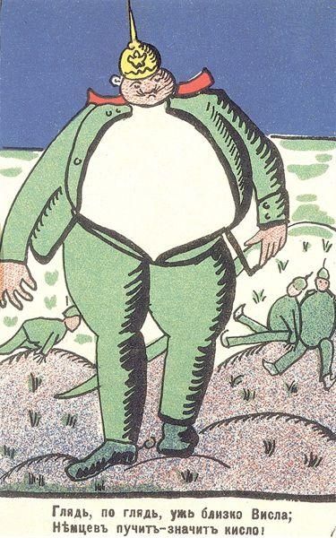
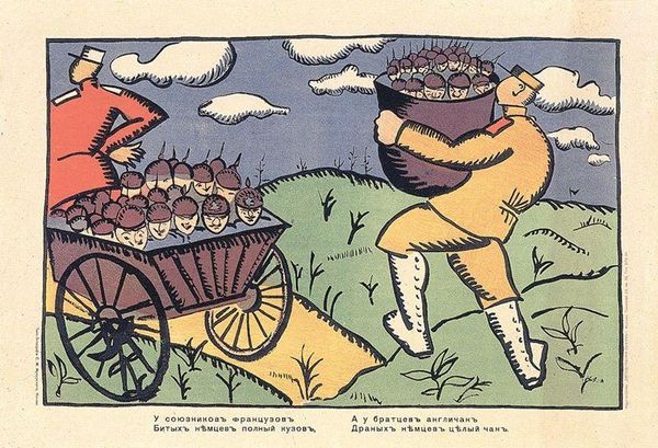
painting, poster
#
cubism
#
painting
#
caricature
#
landscape
#
figuration
#
poster
#
modernism
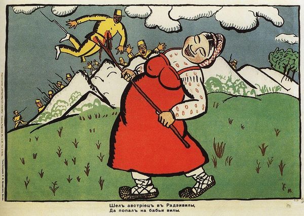
Dimensions: 51.3 x 33 cm
Copyright: Public domain
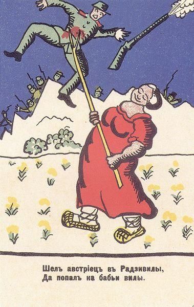
Editor: This is Kazimir Malevich's 1914 poster, "Look, Vistula is Near." The colors are quite striking, almost like folk art, but the distorted figure gives it a distinctly modern feel. What do you see in this piece? Curator: For me, it’s the material and the making that stands out. This isn’t just a painting; it's a poster, a mass-produced object meant to be distributed and consumed. The simplified forms and bold colours speak to its purpose: propaganda. Look at the crude lines, the almost caricature-like depiction of the soldier – how do these choices in production affect its message? Editor: That’s a great point. I hadn’t considered the 'poster' aspect that deeply. So the artistic choices aren't just about aesthetics, they're about effectively communicating a message to a wide audience, like a commentary on class? Curator: Exactly. Consider the social context: it's 1914, World War I is erupting. This poster wasn't meant for a gallery, but for the streets, aiming to shape public opinion. The exaggeration, the almost cartoonish quality— it makes the enemy seem ridiculous, easier to dehumanize, to consume as an idea. Do you think Malevich saw that potential, or do you think this poster transcends its intended function? Editor: That’s sobering to think about. The simplification could also be a necessity because it was produced quickly to be distributed widely and perhaps on less sophisticated printing equipment. I appreciate that it invites questions about propaganda itself, in ways a conventional painting might not. Curator: Precisely. And that awareness of material conditions – the means of production – that's where the real power of art often resides. We have considered it at all, through all it´s elements!
Comments
No comments
Be the first to comment and join the conversation on the ultimate creative platform.
More like this