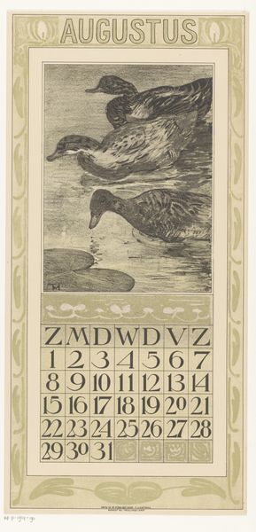
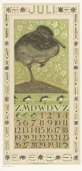
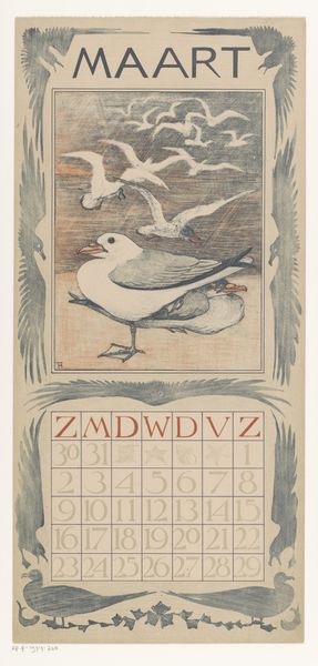
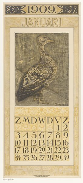
print, woodcut, poster
#
art-nouveau
# print
#
landscape
#
figuration
#
linocut print
#
woodcut
#
poster
Dimensions: height 485 mm, width 210 mm
Copyright: Rijks Museum: Open Domain
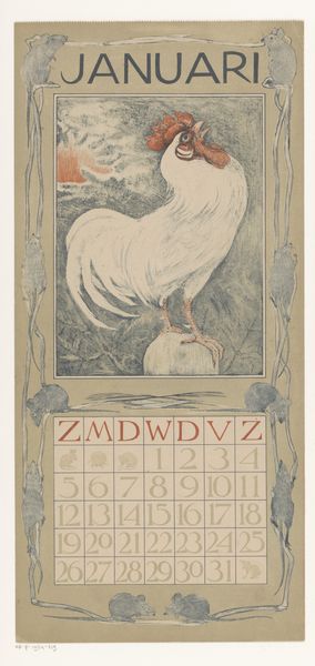
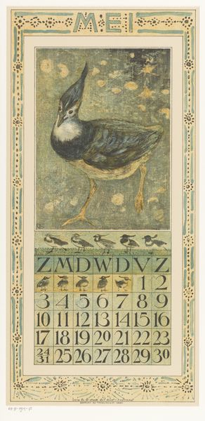
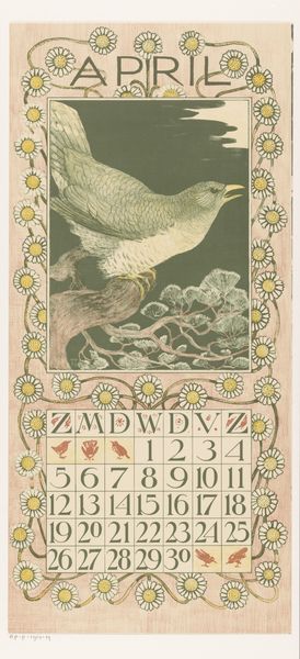
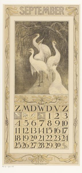
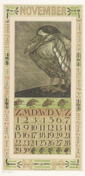
Curator: Here we have Theo van Hoytema’s calendar sheet for January 1903, currently held at the Rijksmuseum. Editor: My first impression is quiet elegance. The restrained color palette – mostly soft greys and muted browns – imbues the piece with a serene, almost melancholic air. Curator: Indeed. Hoytema was very interested in the application of art to everyday life, as you see from the integration of naturalism with calendar functionality. His design aimed to uplift the experience of interacting with everyday objects through aesthetically pleasing forms. Editor: The composition is carefully considered. The peacock, with its graceful neck, takes center stage. Note how its body echoes the rectangular structure of the calendar itself. It creates a visually cohesive design. What do you read from it, Curator? Curator: Beyond the formalism, the choice of a peacock isn't arbitrary. In the Netherlands during the Art Nouveau era, images of animals, particularly birds, carried symbolic weight. Here, the peacock probably signals notions of pride or the coming spring. The use of lithography democratized image distribution, making these sorts of calendars very accessible to the wider public. Editor: Ah, I see that. And technically speaking, I admire the execution of textures, especially the fine lines delineating each feather. Hoytema used woodcut and linocut. This piece seems meticulously carved, imparting depth and vitality to the bird’s form. Curator: And if we think of it, in the context of Dutch society, it’s intriguing. The Rijksmuseum being where it is… Amsterdam was growing in international importance… Editor: The stark contrast between the intricate detail of the peacock and the minimalist rendering of the date grid creates a fascinating visual tension. One could spend the whole month discovering the lines, couldn't one? Curator: Exactly! That tension perhaps reflects a society in transition: embracing modernity and mass production while cherishing older forms of craftsmanship. A pretty insightful piece! Editor: Agreed. I walked into it ready to dismiss another period print and was happy to engage. Thank you.
Comments
No comments
Be the first to comment and join the conversation on the ultimate creative platform.
More like this