drawing, paper, watercolor, ink
#
portrait
#
drawing
#
cubism
#
figuration
#
paper
#
watercolor
#
ink
#
geometric
#
expressionism
#
abstraction
#
line
#
mixed media
Copyright: Public domain
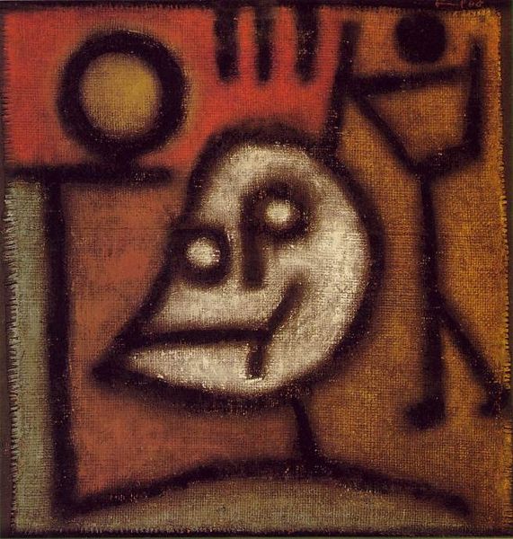
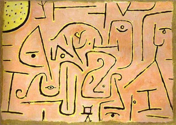
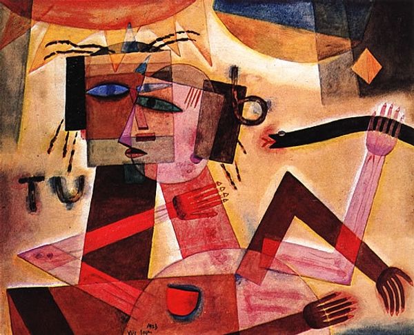
Editor: Here we have Paul Klee’s "Seventeen" created in 1923, a mixed media piece employing ink, watercolor, and other mediums on paper. It's… unusual. There are geometric shapes suggesting a face, yet the expression is so ambiguous, almost unsettling. I’m curious, what compositional elements stand out to you, and how do they contribute to its overall effect? Curator: Notice how Klee distributes pictorial weight. The planes overlap, yes, but how do they intersect and bisect? Take for example the tear falling from the eye which interrupts the compositional balance with its abrupt angularity, thereby disrupting any traditional reading of “portraiture.” Editor: The lines create a sense of depth but it remains flattened, almost like a map. I’m also intrigued by the number "17" inscribed in the corner. It seems deliberate, almost as another layer to the semiotic reading of the work, but its relationship is ambiguous. Curator: Precisely. The linearity and implied planarity create a visual paradox: space suggested through line. What then does the imposition of seemingly random characters infer? Editor: I guess the number underscores the fact that, while resembling a face, it is nothing more than component parts—seventeen elements working, yet not resolving to coherent representation. Curator: Note the interplay of visual tensions, the resolution of a representational object – the arrow – interjected in both instances across an ungrounded portrait. Editor: Thank you. I now understand the way these arrangements are crucial in disrupting and restructuring form in Klee’s unique style, by which line becomes almost a drawing within a drawing.
Comments
No comments
Be the first to comment and join the conversation on the ultimate creative platform.
More like this