graphic-art, print, engraving
#
graphic-art
#
allegory
#
baroque
# print
#
figuration
#
history-painting
#
engraving
Dimensions: height 176 mm, width 138 mm
Copyright: Rijks Museum: Open Domain
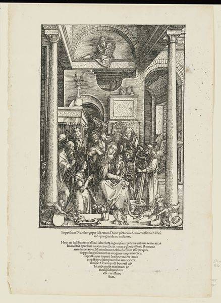
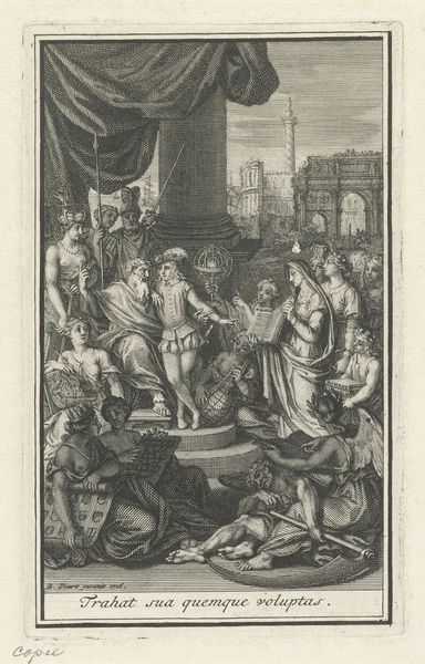
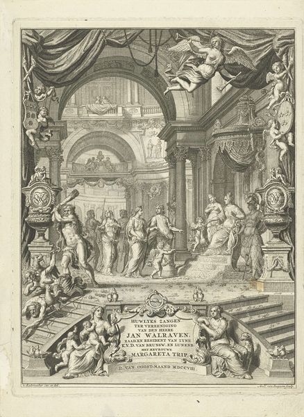
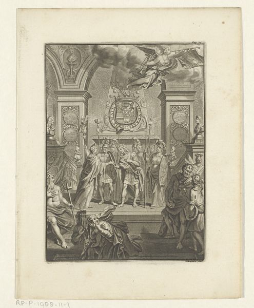
Curator: Welcome. Before us is the title page to Romeyn de Hooghe’s "Hieroglyphica," dating from approximately 1655 to 1708. It’s an engraving, currently held here at the Rijksmuseum. Editor: My first impression is of controlled chaos. There’s a clear architectural framework, but within it, the density of figures is overwhelming. A real visual puzzle. Curator: Precisely! De Hooghe excelled at imbuing objects with symbolism. The whole engraving operates on layers. We see classical statues framing an interior, brimming with figures enacting... scenes of allegory. Editor: What stands out for me is the recurrence of ancient iconography – glimpses of familiar forms imbued with different context; that female warrior in the foreground, possibly representing Minerva? And I believe I see the Egyptian pyramids hinted in the back. These old, potent symbols lend this work depth, and make me feel as though it might speak of continuity and the relay of cultural knowledge. Curator: It’s a fascinating proposition to unpack De Hooghe's intent through recognizable imagery and consider continuity! Looking at the piece objectively, I'm stuck by the density of line work and intricate construction. From the architectural renderings and banner-like inscription at the top, one begins to parse spatial dimensions and deliberate geometric positioning. I wonder if those are all artifacts from how De Hooghe conceptualized design. Editor: Perhaps he was creating visual linkages, suggesting, through composition alone, relationships between these historical concepts that are supposed to guide the eye a certain way; like an open textbook. The positioning of those figures around the perimeter too evokes guardianship. They stand for the legacy of ideas in my mind! Curator: What’s fascinating is considering how all those thematic aspects translate across material. That such an intellectual concept finds appropriate conveyance through stark graphic presentation highlights De Hooghe’s genius as an engraver. He creates balance between form and significance. Editor: This exploration leaves me feeling appreciative. It highlights that even book design can have an abundance of symbolic weight, creating a rich experience prior to reading. Curator: Yes. A powerful introduction indeed—the image working just as rigorously as any text.
Comments
No comments
Be the first to comment and join the conversation on the ultimate creative platform.
More like this