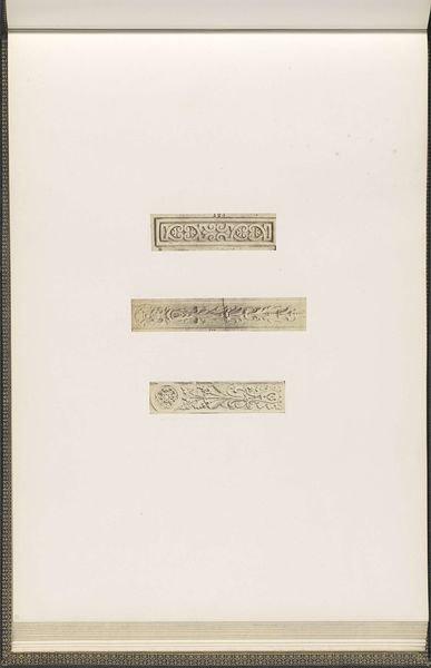
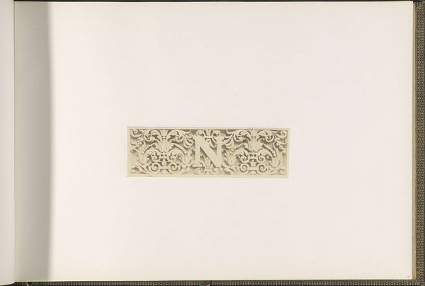
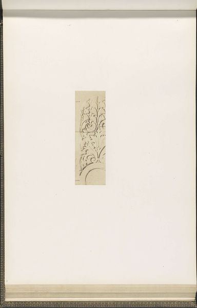
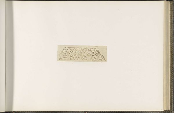
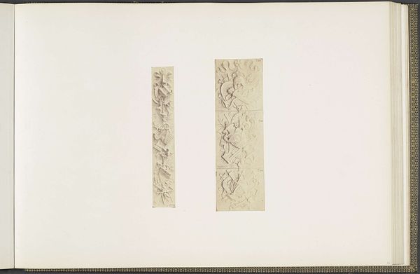
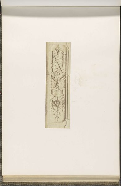
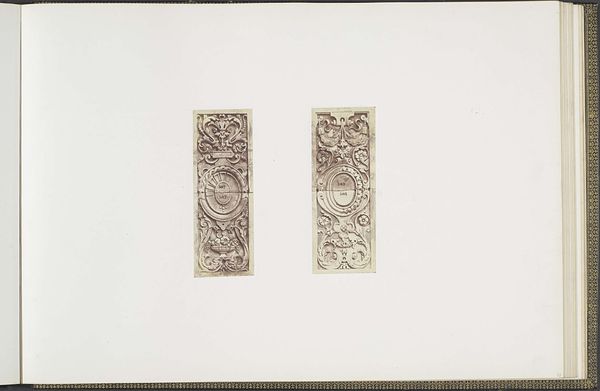
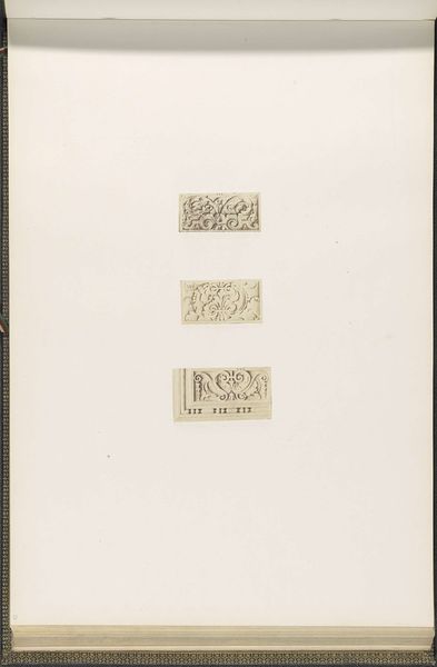
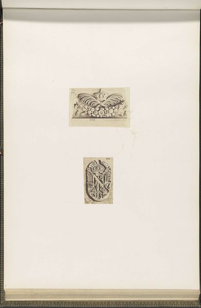
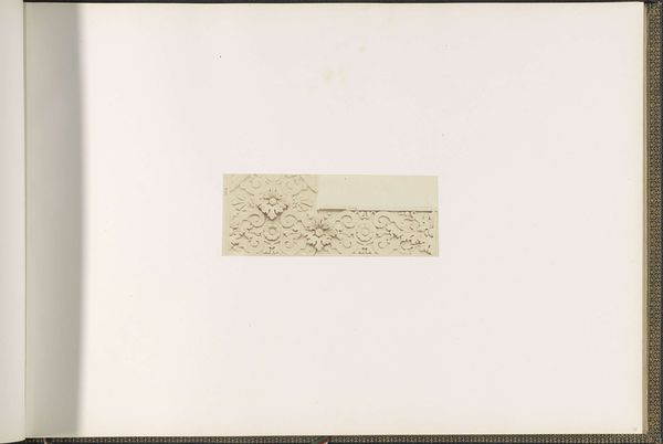
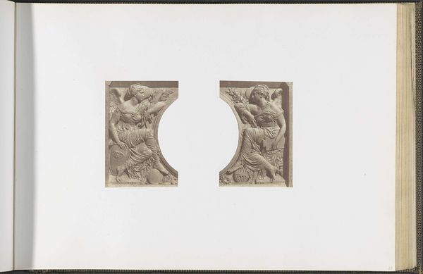
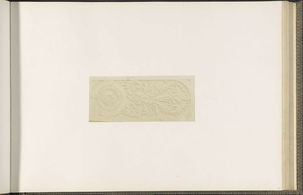
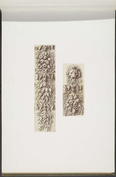
Gipsmodellen voor gevelversieringen aan de Cour Lefuel van het Palais du Louvre c. 1855 - 1857
0:00
0:00
edouardbaldus
Rijksmuseum
drawing, relief, paper, ink
#
drawing
#
neoclacissism
#
pen sketch
#
relief
#
paper
#
ink
#
pen work
#
sketchbook drawing
#
academic-art
Dimensions: height 378 mm, width 556 mm
Copyright: Rijks Museum: Open Domain
Editor: This is "Gipsmodellen voor gevelversieringen aan de Cour Lefuel van het Palais du Louvre," circa 1855-1857, by Edouard Baldus. It’s a pen and ink drawing on paper showing plaster models, and what strikes me immediately is the level of detail packed into such a small space. What do you see in this piece? Curator: Formally, I'm drawn to the contrasting textures and lines. Baldus has expertly used ink to simulate the relief of the plaster models. Observe how the cross-hatching defines depth and shadow, giving form to the ornamentation. Notice, too, how each element is delineated, clear and distinct in form yet cohesive to the design as a whole. How does the overall composition affect your perception of the design? Editor: It feels very balanced. The two columns mirror each other in a way, even if the specific details are different. Does that symmetry speak to the architectural style they're intended for? Curator: Precisely! The symmetry underscores the Neoclassical underpinnings of the Cour Lefuel at the Louvre. It reveals a conscious effort to impose order and harmony through balanced forms. The pen work is functional, intended as part of design development, so aesthetic consideration is a function of technique, not the objective of this object. Consider the placement on the page: how does the white space impact your viewing of these designs? Editor: The negative space really isolates the designs, allowing us to focus on the details without distraction. I guess I hadn't thought about how deliberate that was. Curator: Precisely. This sketch, or series of sketches, illustrates a balance between function and artistic merit. By understanding the formal aspects, we get a deeper understanding of the piece. Editor: This has definitely opened my eyes to seeing beyond the surface and appreciating the construction of the piece itself. Curator: Indeed. Close looking at form is a gateway to a wider aesthetic appreciation.
Comments
No comments
Be the first to comment and join the conversation on the ultimate creative platform.
More like this