Dimensions: height 66 mm, width 62 mm
Copyright: Rijks Museum: Open Domain
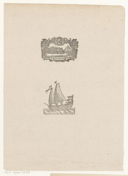
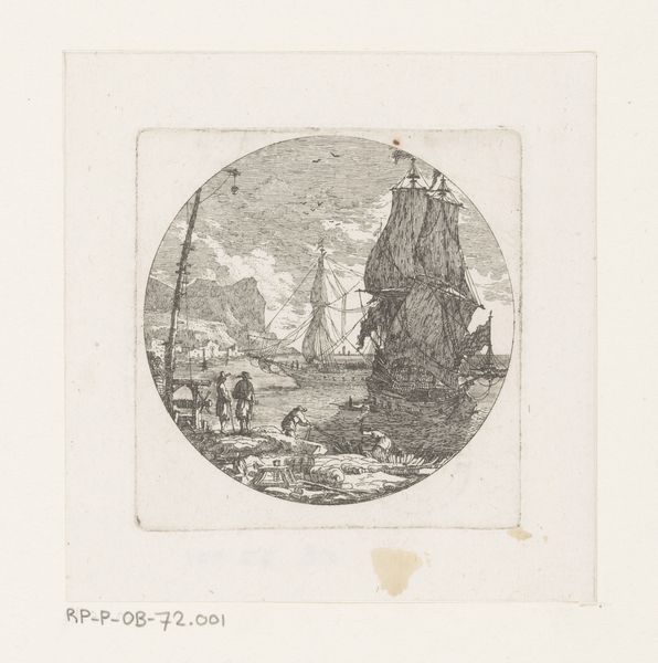
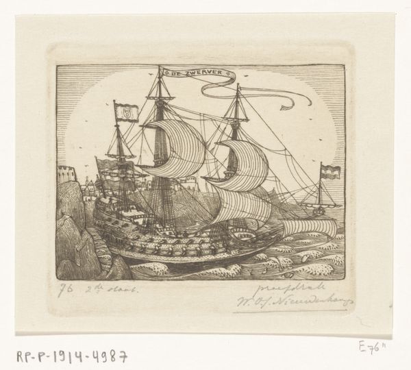
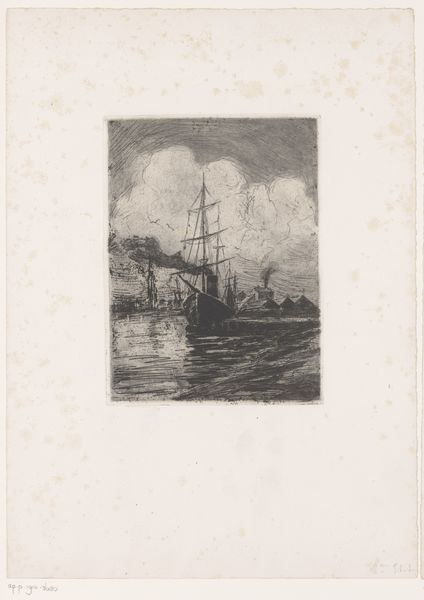
Curator: Welcome. Let’s consider this print titled "Ex libris met een schip op het water," dating from 1839 to 1897, created by Maurits Johannes Lens. It's an engraving, demonstrating remarkable detail for its small scale. Editor: The immediate impression is one of journey, and perhaps a touch of the unknown. The ship is small but purposeful against what appear to be ominous, if stylized, waves. There’s a suggestion of both peril and grace here. Curator: Indeed. The artist has made some curious structural choices here; note the tension between the ship's ornate depiction and the simplicity of the distant land mass and tower. The contrasting densities create visual interest. And the line quality in the water is beautifully rhythmic, almost hypnotic. Editor: Rhythm, absolutely. Ships have, for centuries, represented safe passage to a new world and are frequently deployed to depict transitions and turning points in life, so I imagine the client was thinking of personal change. Also the Latin inscription scrolls beneath. Curator: It reads, as best as I can discern given the stylized script, "Peritia Gratia Ove". Presumably it served a meaningful heraldic or motto-like function to its commissioner. A declaration of prowess and grace perhaps? Editor: Precisely. It’s interesting that the vessel sails towards a seemingly undefined horizon. Is it meant to express optimism? Caution? Perhaps it's simply about facing forward. The image makes it difficult to read whether this new venture is perceived as being inherently promising or laden with risks. Curator: Or could it perhaps signify, structurally, both, the formal balance within the depiction? Observe how Lens leads your eye from the turbulence in the lower foreground toward the still point in the upper section, framing the tower on the shore… it's all incredibly measured and balanced formally. Editor: Yes, that balance provides a powerful framework. Even the lettering provides a contrast between dense, compact wording on the left and spread lettering on the right. I sense an exploration of the push and pull between control and surrender to the fates. Curator: So, in terms of pure compositional qualities, Lens uses contrasts – light and dark, detail and void – to build up and release tension, whereas… Editor: Whereas through it all Lens utilizes ship imagery to communicate more subtly how humans relate to progress and providence as concepts and concrete things. Quite profound, wouldn’t you agree?
Comments
No comments
Be the first to comment and join the conversation on the ultimate creative platform.
More like this