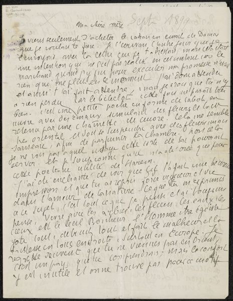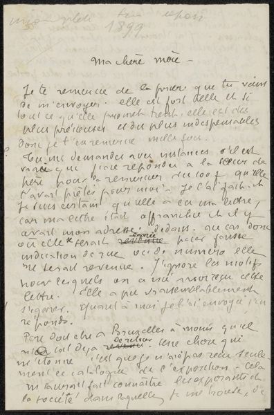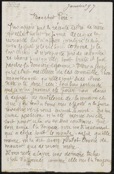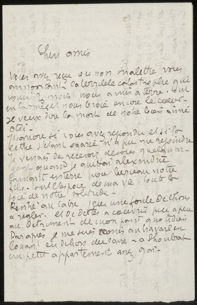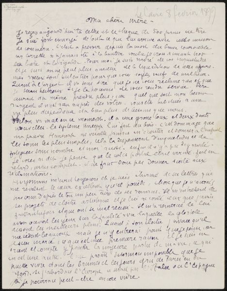
before 1899
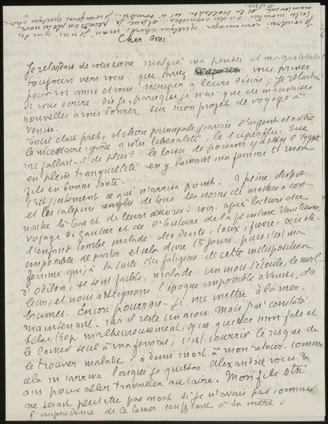
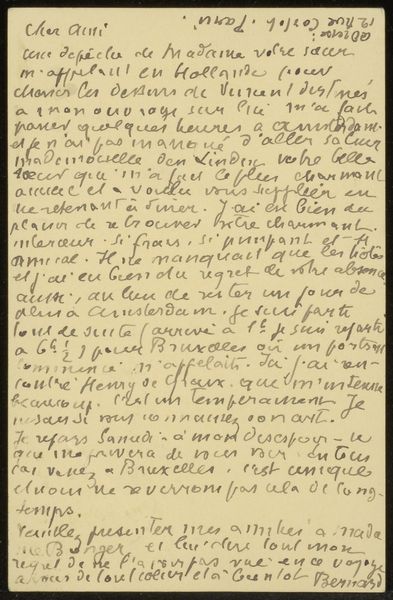
Brief aan Andries Bonger
Listen to curator's interpretation
Curatorial notes
Curator: This is "Brief aan Andries Bonger" by Émile Bernard, created before 1899. It's an ink drawing on paper, essentially a letter, dense with handwritten script. Seeing it now, I am transported, lost in another time. Editor: It does feel intensely personal. It is, after all, a letter, not meant for us. All that dense handwriting looks so antiquated! It's making my eyes glaze over already! What strikes you most about this piece? Curator: Well, for starters, the sheer density. The words pack the page like...like memories crowding a room. Bernard doesn’t leave much breathing space, does he? Have you considered the intention of this lack of negative space? It seems he wants to communicate something and isn't thinking much about making it elegant or precious...it just needs to *get out*. Editor: It really emphasizes the urgency of communication, I see that. What do you think he's writing about? And what about the aesthetics of the letter itself? Did letter-writing have its own design rules back then, you think? Curator: Based on my poor knowledge of 19th-century French, he appears to describe challenges he faced in his travels in Venice and anxieties about disease. In any event, I’m rather caught up in the overall texture, the almost chaotic arrangement of the words; to me, it resembles a landscape, a kind of... verbal terrain. What do you think? Is there any other modern work with a similar hand lettering style? Editor: I hadn’t considered it as a visual landscape. I was too busy seeing *words*. As for something similar from today...well, it is evocative of certain notebook art or even street art, which focuses less on legibility and more on immediate expression. I love that we made such different connections! Curator: And now I see *words* because you've brought me back down to earth! Wonderful.