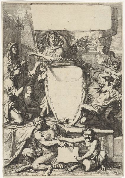
print, engraving
#
allegory
#
baroque
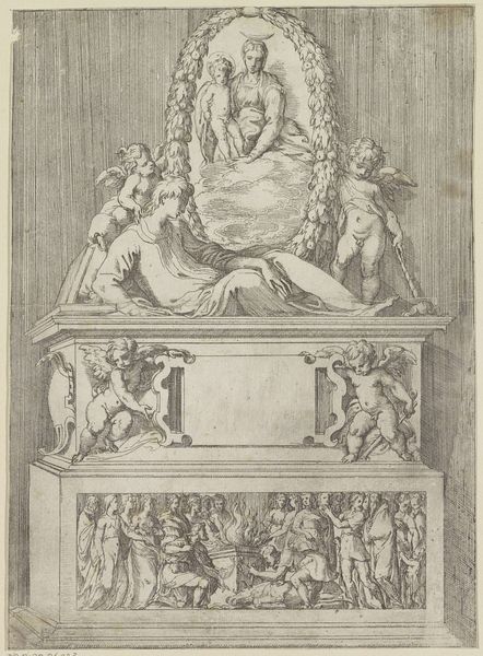
# print
#
figuration
#
engraving
Dimensions: height 139 mm, width 105 mm
Copyright: Rijks Museum: Open Domain
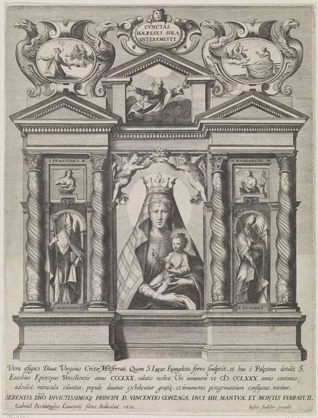
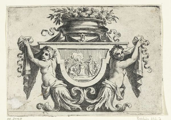
Editor: This is the "Titelprent met cherubijnen," a print by Frederick Bloemaert from after 1640, located at the Rijksmuseum. It strikes me as quite symmetrical and ornate, fitting its period. What formal qualities stand out to you in this engraving? Curator: The engraving presents a compelling study in baroque formalism. Note the bilateral symmetry, how the cherubs are mirrored around a central axis. The blank cartouche commands attention by its very emptiness, begging for textual intervention to complete the composition. The cherubs act as visual anchors, their positions drawing the eye upwards and downwards. Editor: I see that. The cherubs' bodies and wings form almost perfect curves. How does the texture of the engraving play into the overall impact? Curator: Consider the meticulousness of the hatching and cross-hatching. Notice how Bloemaert modulates tone through varying the density of lines, creating the illusion of volume and texture, contrasting with the smoothness of the central cartouche. It contributes to the dynamic quality characteristic of Baroque art. Does the light seem convincing to you, considering its technical execution? Editor: The light seems focused, but somewhat flat. Is that due to the limitations of engraving, or is there something else happening compositionally? Curator: The lighting, while proficiently rendered, does indeed appear constrained by the medium, lacking the sfumato achievable in painting. Nevertheless, the technical skill employed, observed solely from the engraving's formal aspects, is evident and contributes to its aesthetic appeal. The artist masterfully balanced form and technique within its time. Editor: I hadn't considered the texture in that way. Thanks, it offers much to reflect upon.
Comments
No comments
Be the first to comment and join the conversation on the ultimate creative platform.
More like this