Copyright: Public domain
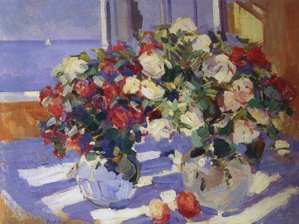
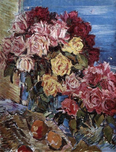
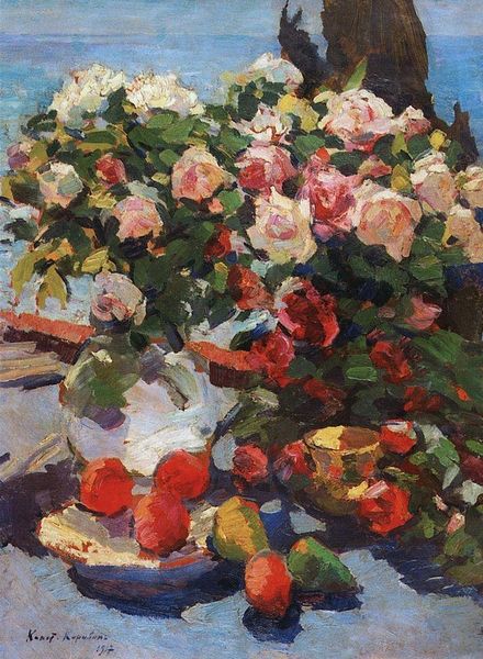
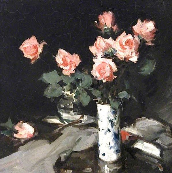
Konstantin Korovin made 'Roses', with oil on canvas, sometime around 1912, and it feels like he had a great time doing it. The painting’s all about a really playful approach to mark making, full of daubs and dashes of color, that build up the image piece by piece. Up close, you can almost feel the texture of the paint, thick and creamy in some spots, thinner and more transparent in others. Look at the way he layers those strokes to create the roses, how the pinks and reds swirl together with touches of white and green. It's like he's not just painting roses, but also painting the experience of seeing them, the light shimmering, the colors blending. There's a really dark patch of ultramarine shadow under the vase that almost feels like a counterpoint to the sweetness of the flowers, and brings a kind of depth to the whole piece. It all puts me in mind of Manet, or maybe even some of the early Fauves, how they were pushing the boundaries of color and form to capture a feeling, not just a picture. It’s this ongoing conversation between artists, each one building on what came before.
Comments
No comments
Be the first to comment and join the conversation on the ultimate creative platform.
More like this