Copyright: Rijks Museum: Open Domain
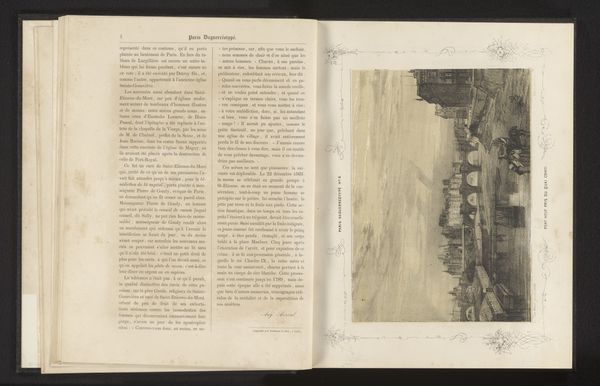
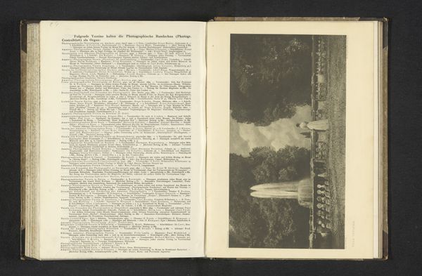
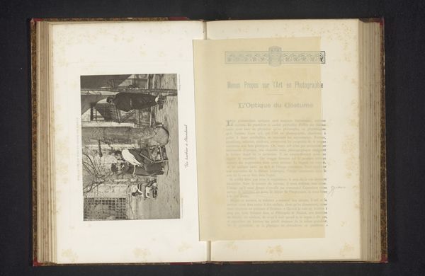
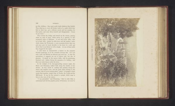
This newspaper, from the archive of Philip Zilcken, must have been made around 1908. It's an anonymous piece, but its layout and typography speak volumes about its time. It's all about the texture, isn't it? The way the ink sits on the page, the subtle variations in tone, the slight imperfections that give it character. Look closely at the title, "De Hofstad," the way the letters are laid out, with those beautiful, ornate details above. It's not just information; it's a visual experience. Each article is a small image, a world in miniature, all fitting together. The images are printed with a duotone that looks similar to my own mark making on a canvas; a lot of light and dark. It reminds me of a collage by Kurt Schwitters, how he could turn everyday scraps into something extraordinary. This newspaper, in its own way, is doing the same, elevating the mundane to the level of art. It embraces ambiguity, invites multiple interpretations, and reminds us that art is everywhere, if we only know where to look.
Comments
No comments
Be the first to comment and join the conversation on the ultimate creative platform.
