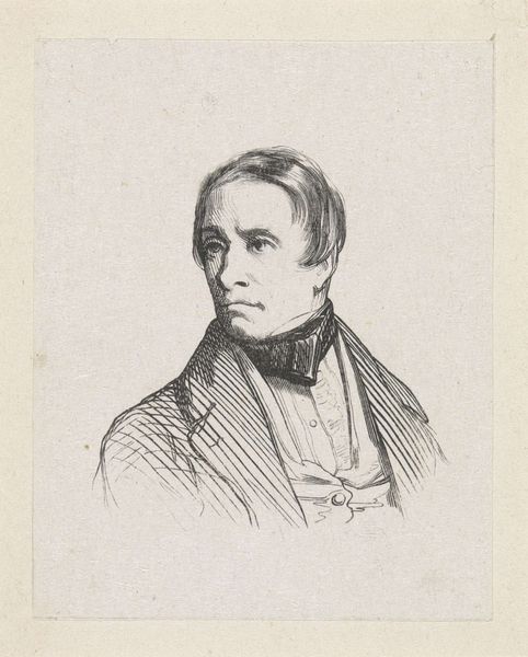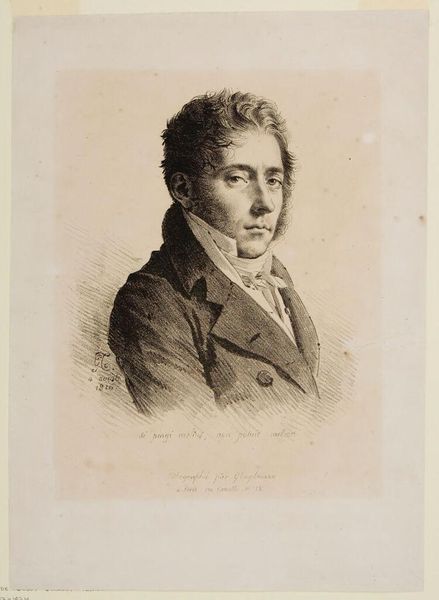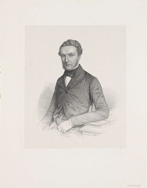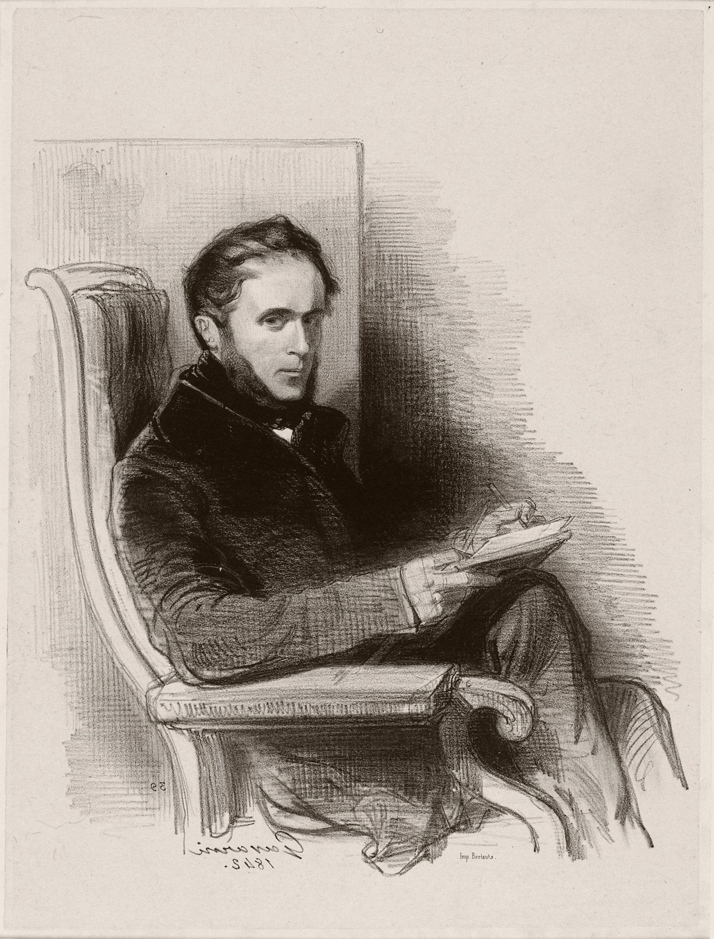
1842
Raymond La Garrigue
Listen to curator's interpretation
Curatorial notes
Editor: Here we have Paul Gavarni's 1842 lithograph titled "Raymond La Garrigue," housed here at the Minneapolis Institute of Art. It strikes me as a study in contrasts, with the sharp lines of the figure set against the soft shading of the background. What's your read on this portrait? Curator: The success of this lithograph lies precisely in its strategic use of contrasting marks. Notice the varying densities of line, strategically deployed to define form and create spatial depth. How does the hatching around La Garrigue's figure influence your perception of volume? Editor: It makes him feel almost… suspended, like he's emerging from the page. Is that a trick of the light, or how the artist worked the stone? Curator: A perceptive observation! Gavarni masterfully exploits the inherent qualities of lithography. Note the nuanced gradations achieved through varying pressure and the application of tusche. The deliberate contrasts— between sharp detail and blurred lines— serve to direct the viewer's gaze. Consider the interplay between light and shadow in defining his subject's countenance; where does light articulate emotion? Editor: Around his eyes, I think. There’s a certain intensity in his gaze, emphasized by the shading. The lightness around his hand too, draws attention to the act of writing. Curator: Precisely. Gavarni harnesses formal elements – line, value, composition - to craft a portrait that transcends mere likeness, suggesting interiority. How might the absence of a clear setting contribute to our engagement with La Garrigue's psychological space? Editor: I suppose it puts the emphasis entirely on him and his thoughts. Less distraction. Looking closely, you can really see how he layered the lines. I hadn’t noticed that before. Curator: The lithographic technique truly allows for a richness in the tonal variations, doesn't it? Considering solely the formal arrangement, a wealth of meaning is conveyed. Editor: Yes, definitely! It is fascinating how much you can read from the marks and shapes alone. I appreciate you breaking it down like that.