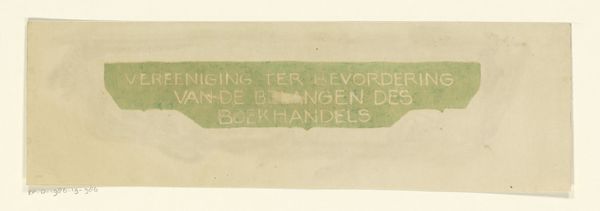
drawing, graphic-art, paper, typography, ink
#
drawing
#
graphic-art
#
art-nouveau
#
paper
#
typography
#
ink
#
decorative-art
Dimensions: height 81 mm, width 129 mm
Copyright: Rijks Museum: Open Domain
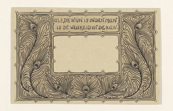
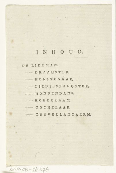
Curator: Here we have Reinier Willem Petrus de Vries’ “Hoofdstukkader,” a chapter heading created in 1899. It's rendered with ink on paper, displaying both drawing and graphic art qualities. Editor: My first thought is its delicacy, almost ephemeral, despite being printed in stark black ink. The lines have such graceful curves, there is a symmetry with underlying tension, and an overall restrained power to it. Curator: Yes, that tension comes from the Art Nouveau aesthetic which attempts to reconcile a love of nature with the industrial age. Notice how botanical and geometric forms intertwine. The floral motifs are stylized and then caged, if you will, within this sharp, angular frame. It represents the "Gewetens," or the contents of consciousness, a subject very attuned to symbolism of the time. Editor: The dark ink plays cleverly against the stark paper, lending emphasis. I notice that while seemingly simple, the composition is meticulously balanced. The eye is immediately drawn to the framed text, which acts as the structural keystone. Do you agree the surrounding decorations, like pointed flourishes, almost serve as symbolic directional markers, inviting deeper contemplation of the text's meaning? Curator: Absolutely. They aren't merely ornamentation. Each detail adds a layer of depth, reinforcing the idea of "contents". The upward arrows suggest a reaching or striving, very reflective of turn-of-the-century anxieties and aspirations. Editor: It strikes me now how this graphic is about the internal more than the external—using lines, geometry and even these abstract flowers to shape thoughts rather than depicting physical forms. Curator: And it proves just how evocative something so understated can be. Reinier Willem Petrus de Vries reminds us that graphic design, particularly in Art Nouveau, can serve as a powerful visual metaphor. Editor: Exactly. Now I better grasp that the arrangement of lines and shapes generates meaning beyond pure aesthetics, pushing me as a viewer to seek understanding through feeling, through intuition—precisely how abstract concepts are communicated via physical form.
Comments
No comments
Be the first to comment and join the conversation on the ultimate creative platform.
More like this