drawing, print, ink, engraving
#
drawing
#
baroque
#
pen drawing
# print
#
pen sketch
#
old engraving style
#
ink
#
geometric
#
line
#
engraving
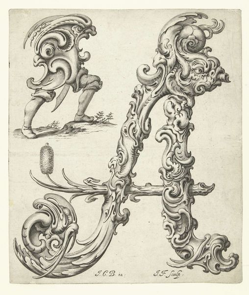
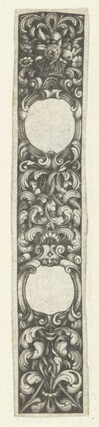
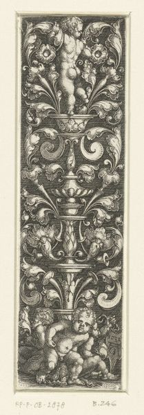
Dimensions: height 210 mm, width 130 mm
Copyright: Rijks Museum: Open Domain
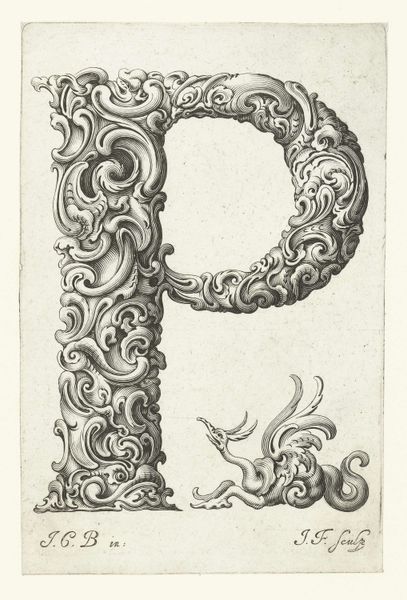
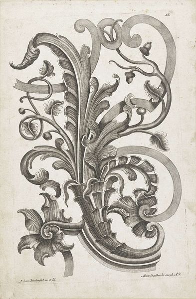
Curator: Look at this stunning rendering, circa 1645-1650, of the letter "I." Jeremias Falck used engraving, ink, and print to achieve this swirling design. Editor: My initial thought is how theatrical this image feels, a bit like an ornate baroque stage prop. It possesses a distinct weight, almost a sculptural solidity, despite being a flat, graphic work. Curator: Absolutely. Falck was working within the Baroque period, so think about the social context: immense power structures, religious zeal, and a focus on grandeur. The letter "I" is elevated beyond mere alphabet. Consider the "I" as representative of "I," the individual, presented within this imposing, ornamented framework. Is Falck subtly commenting on the individual’s role within a society dominated by overwhelming institutions? Editor: I'm struck by the tension created through the contrast between line and form. There's a very disciplined arrangement of swirling motifs. What structural principles or geometric concepts could we be seeing in play here? Are we talking golden ratio proportions in relation to this letter? Curator: We could certainly analyze it through a post-structural lens, deconstructing its meaning beyond simple aesthetics. It invites examination through various interpretive frameworks. It embodies more than its surface implies; it presents power dynamics through aesthetic design. Editor: Precisely. It’s a fascinating piece structurally—and it leads me to ask if it subverts or amplifies the letter’s inherent linearity. Look closely—notice the clever interplay between rigid structure and almost liquid, flowing ornamentation. The way the lines give depth—how can that relationship express semiotic concepts? Curator: Considering how many engravings during this era reinforced existing class hierarchies and royal power, there's definitely room for an intersectional reading here, examining class, gender, perhaps even subtle political resistance embedded within the decorative elements. It's both beautiful and dense with potential interpretations. Editor: A single letter becomes a study in controlled visual dynamics. The technical virtuosity on display demands our focused observation—an immersive encounter with ink and line, where even the smallest modulation enriches our engagement.
Comments
No comments
Be the first to comment and join the conversation on the ultimate creative platform.
More like this