painting, acrylic-paint
painting
pop art
colour-field-painting
acrylic-paint
abstract
form
geometric
geometric-abstraction
line
modernism
Copyright: Modern Artists: Artvee
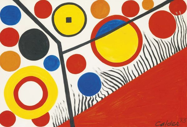
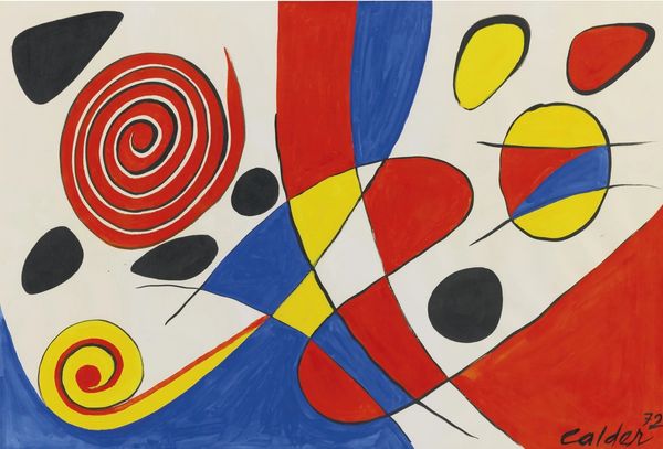
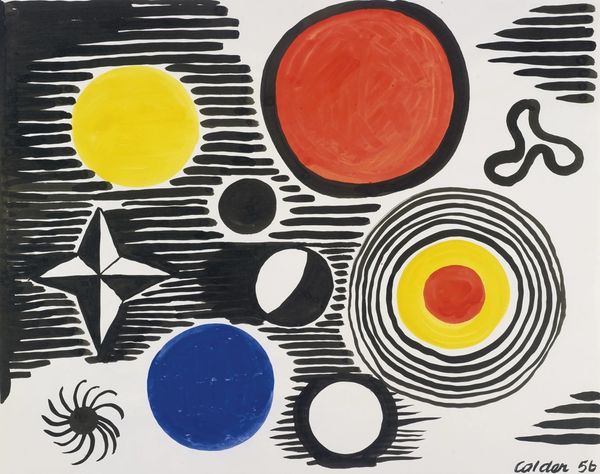
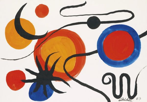
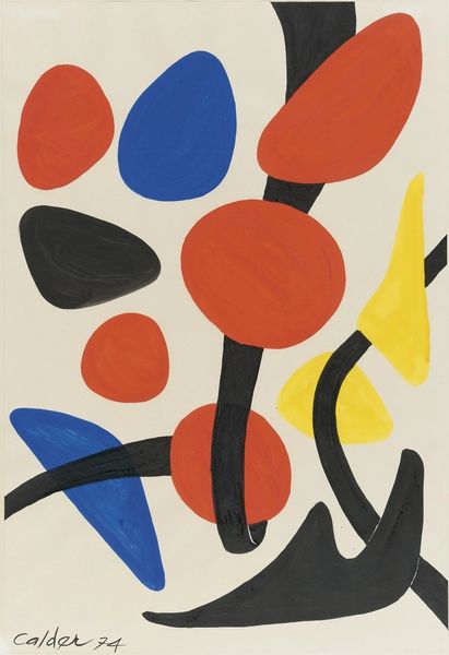
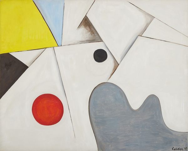
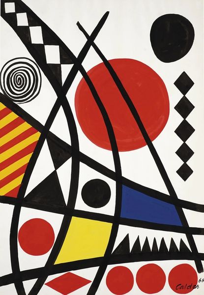
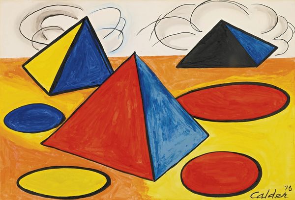
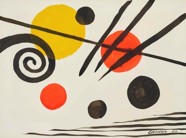
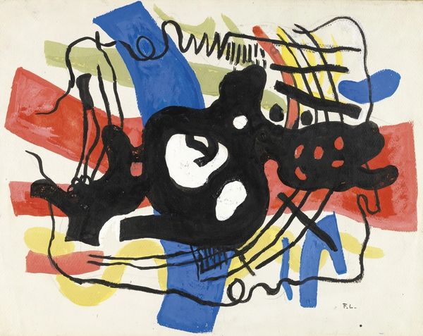
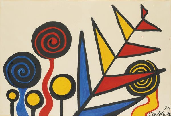
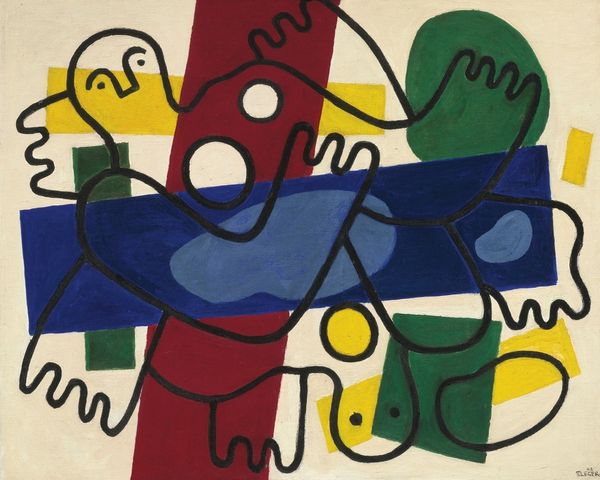
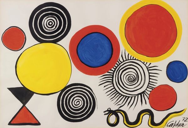
Curator: I'm struck by how joyful Alexander Calder's "Parallelogram" feels—even with its stark lines and primary palette. What's your take on this burst of geometric optimism? Editor: It screams mid-century, doesn’t it? It's 1961, after all, and acrylic paint, his chosen medium, was really coming into its own as an affordable alternative to oils, a key facilitator for expanding access and speeding up the production cycle for a certain type of art object. Curator: Affordable, yes, but there's also something so elemental about the forms, don't you think? Black circles hover, like playful planets, over red, yellow, and blue geometric forms dissected by sharp lines. The painting dances between order and chaos. Editor: The interesting thing is to consider how the aesthetic is often divorced from its actual modes of production: Calder here, but really with much of so-called “Pop Art” and "Colour-Field painting," there’s an emphasis on formal simplicity and often, a disavowal of the artist’s hand—yet of course, material realities and production costs shape everything! We're often asked not to notice the hand or the work... Curator: Perhaps, but perhaps he is inviting us to see new potential. The movement, lightness, the hint of improvisation—I almost feel as if I can reach out and rearrange the shapes myself. He created the mobile; maybe this is an unmoving dance in its own right? Editor: I suppose. To me it’s evocative of factory production lines themselves: uniform colors quickly applied and boldly demarcated with clean lines, efficiently filling the canvas as if on a strict timetable... Curator: But those "imperfections" though, the tiny variations in each circle and shape, offer glimpses into his touch—it pulls us into the making. He does leave space for improvisation...I get this notion of an artist energized by form and motion... Editor: And energized too, by new, cheaper, and more accessible material at his fingertips, produced and distributed by an economy of ever-quickening circuits of global capital. The acrylic paint really let the lines and shapes shine, inexpensively produced as it was... Curator: Right, but as we close, maybe Calder himself would argue that the true beauty of “Parallelogram” lies in how it manages to be precise and delightfully imperfect simultaneously. Editor: Indeed. I leave wondering how those colorful fields impact what sort of labor gets framed as beautiful—or invisible.
Comments
No comments
Be the first to comment and join the conversation on the ultimate creative platform.
