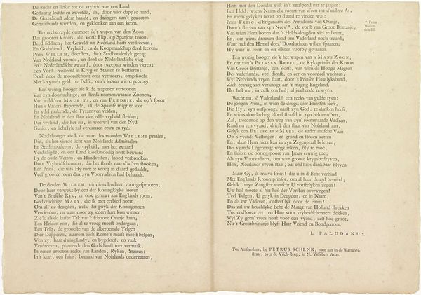
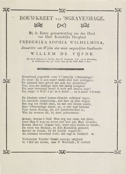
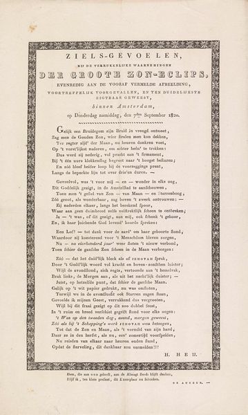
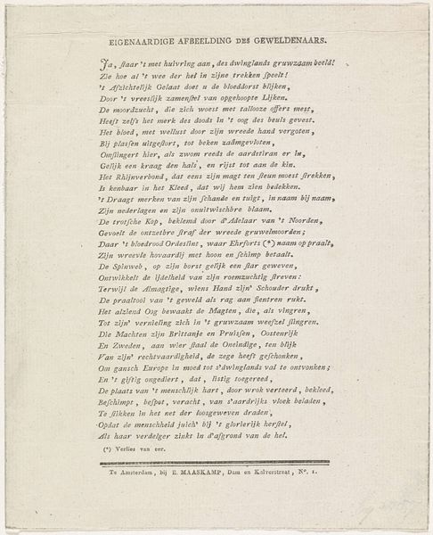
Tekstblad behorende bij de graftombe van Leonard Marius van der Goes 1652
0:00
0:00
joostvandenvondel
Rijksmuseum
graphic-art, print, textile, paper, typography
#
graphic-art
#
aged paper
#
dutch-golden-age
# print
#
typeface
#
hand drawn type
#
textile
#
paper
#
typography
#
fading type
#
stylized text
#
thick font
#
handwritten font
#
classical type
#
historical font
#
columned text
Dimensions: height 467 mm, width 326 mm
Copyright: Rijks Museum: Open Domain
Curator: This fascinating typographical broadside, "Tekstblad behorende bij de graftombe van Leonard Marius van der Goes," from 1652, composed by Joost van den Vondel… it breathes! What's your take? Editor: Well, the first thing that strikes me is the age of the paper. It's incredibly well-preserved, and I’m drawn to the, uh, density of the text. I wonder, what does this particular layout and style of lettering tell us about its function and intended audience? Curator: Exactly! It's meant to impress. Notice how the text, a poem honoring Leonard Marius, fills the entire page, creating a sense of importance and lasting legacy. The typography itself is an art form – do you see how some letters have these flourishes, almost like miniature sculptures? It speaks of classical influences, of learned men deeply rooted in tradition. This was displayed near a tomb; what kind of impact would such elaborate verse have? Editor: It's like the text *is* the monument! The initial 'W' looks particularly ornamented. Curator: Precisely. Imagine seeing that, knowing this ornate piece memorializes someone! Van den Vondel truly composed the typeface to resonate visually with the themes in the poem – grief, respect, and remembrance, wouldn't you say? Editor: Yes, I definitely agree. Seeing the poem as part of a memorial provides even greater depth and understanding of the historical moment. Curator: It becomes an artifact in itself, doesn't it? Van den Vondel’s words become immortalized by font and printing press. Editor: Definitely makes me think differently about the power of typography. Thanks!
Comments
No comments
Be the first to comment and join the conversation on the ultimate creative platform.
More like this