drawing, paper, ink
#
drawing
#
narrative-art
#
baroque
#
figuration
#
paper
#
ink
#
history-painting
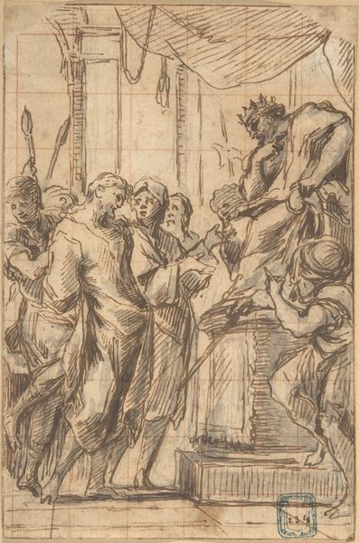
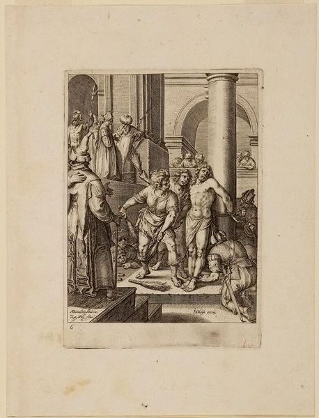
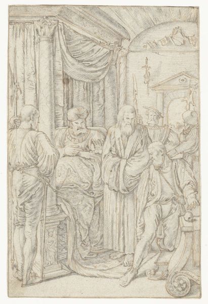
Dimensions: height 110 mm, width 70 mm
Copyright: Rijks Museum: Open Domain
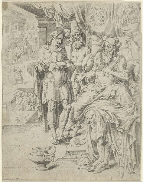
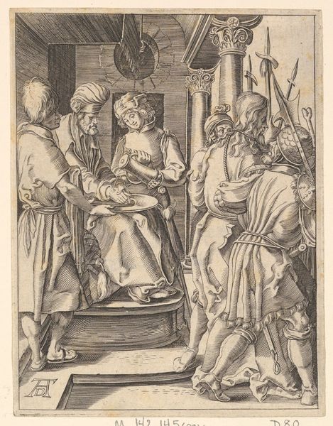
Editor: Here we have Jan Goeree's drawing, "Christ Before Pilate," made sometime between 1680 and 1731 using ink on paper. The scene is, well, pretty stark and minimal, almost like a stage set. What's your take on how the composition drives the narrative here? Curator: Note how Goeree structures the composition with an assertive, almost diagrammatic quality. The linearity is prominent. Figures are defined by outline, grouped to direct the eye towards Pilate. Editor: So, it's not just about what's happening, but also about how he's leading us to see it? Curator: Precisely. Consider the restricted tonal range. Goeree deploys wash to articulate volume sparingly, reinforcing the drawing’s essential flatness and its nature as a constructed image, rather than a mimetic representation of reality. Do you notice how the architectural setting frames and contains the figures, almost trapping them within a defined space? Editor: Yes, it's like the space itself is contributing to the tension, constricting the figures. Are you implying the technique underscores this controlled theatricality? Curator: Indubitably. The limited palette and precise lines emphasize the deliberate artificiality. There is the tension between representation and pure, formal arrangement. It’s a potent articulation of pictorial space dictating emotional response. What elements do you observe creating tension or unease? Editor: I think the direct gazes and gestures aimed right at Pilate. It seems strategic on Goeree's part. I also like that, from a stylistic perspective, it seems pretty restrained given it is considered to be a Baroque piece. Curator: A valuable insight. Often baroque can imply ornamentation, but this adheres to strong compositional elements. Indeed. Perhaps that is something to explore as we move forward.
Comments
No comments
Be the first to comment and join the conversation on the ultimate creative platform.
 Collect
 React
React Comment
More like this