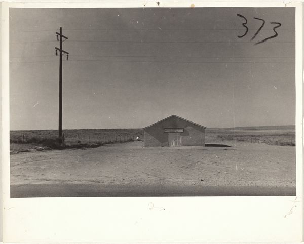
print, photography, gelatin-silver-print
#
print photography
# print
#
landscape
#
social-realism
#
street-photography
#
photography
#
gelatin-silver-print
#
realism
Dimensions: sheet: 20.2 x 25.2 cm (7 15/16 x 9 15/16 in.)
Copyright: National Gallery of Art: CC0 1.0
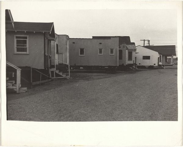
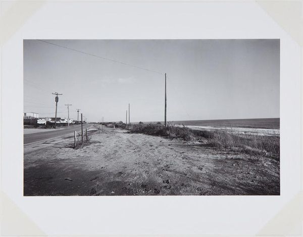
Editor: This is Robert Frank's "Houses—Nevada or Arizona," taken in 1955, a gelatin silver print. There's something bleak about the repetitive structures stretching into the distance under that heavy sky. What strikes you about its visual qualities? Curator: The image hinges on the rigorous organization of forms. Note the severe horizontality established by the row of houses and the ground, bisecting the frame. This line is further emphasized by the insistent recession into space. What compositional strategies create this mood of, as you say, bleakness? Editor: I guess the tire tracks, they seem to guide my eye straight to the horizon, emphasizing the distance and, because they're parallel, create the feeling of repetition and emptiness. Also, there's a real lack of visual variation, particularly in tone; even the sky seems to mirror the flatness of the ground. Curator: Precisely. Consider the interplay of light and shadow, or rather, the lack thereof. Frank has captured a scene in seemingly flat, diffused light, minimizing contrast and flattening the architectural forms. This manipulation serves to de-emphasize individuality and foreground the structural similarities. How might that absence of distinct tonal variation shape our reading? Editor: It almost feels like he’s removing any sense of dynamism, or personality, draining any potential for a visually engaging contrast. Curator: And in this flattening we perceive the underlying structure, the inherent geometry. The houses, despite their subtle differences, become modules within a larger system. Their positioning evokes a deliberate visual cadence. It's about reducing the scene to its essential components, allowing the viewer to dissect its structure and construction. Editor: So by minimizing the distractions of light and shadow and even texture, he's highlighting the underlying, almost mathematical structure of the scene? It’s an interesting point about how de-emphasis creates emphasis. Curator: Exactly. By understanding those aesthetic choices we’re better positioned to think about his intentions and achievements here.
Comments
No comments
Be the first to comment and join the conversation on the ultimate creative platform.
More like this