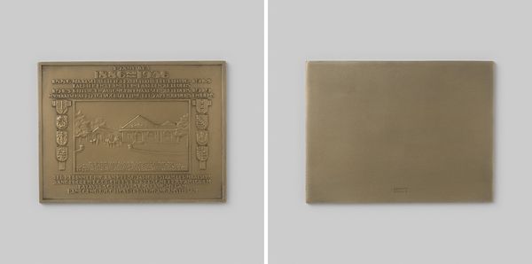
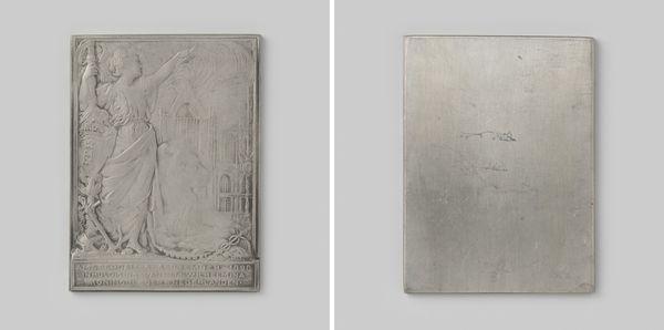
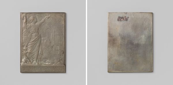
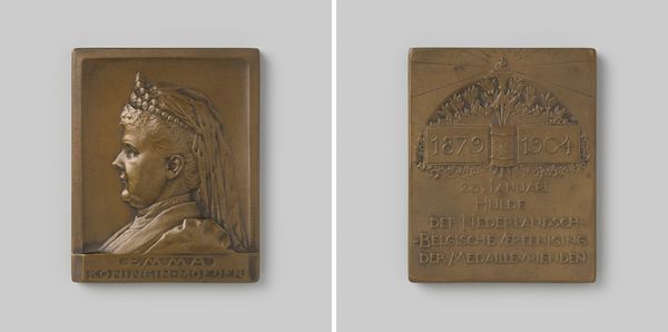
Prijsplakette van de Historische Tentoonstelling Amsterdam 1275-1925 op naam van het Koninklijk Oudheidkundig Genootschap 1925 1925
0:00
0:00
metal, relief, sculpture
#
metal
#
sculpture
#
relief
#
geometric
#
sculpture
#
cityscape
#
history-painting
#
modernism
Dimensions: width 5.0 cm, height 7.1 cm, weight 104.03 gr
Copyright: Rijks Museum: Open Domain
This rectangular plaque was made by J. Richters in 1925 to commemorate the Historic Exhibition of Amsterdam. See how the raised design gives it a kind of bas-relief effect? I’m really drawn to the way the city buildings and the figures almost seem to emerge from the surface. The incised lines that define the architectural forms are so economical, so direct. It's as if Richter’s hand moved across the metal like a sculptor drawing in space. The metallic surface is cool and smooth. The texture of the metal contrasts with the rougher forms of the architecture. This reminds me a little bit of what you see in Art Deco designs from the period, a stripped down, streamlined aesthetic. It reminds me of the work of someone like Hannah Höch, thinking about new ways to imagine and experience urban space. Art is a constant dialogue, where artists borrow, reinterpret, and respond to one another across time. It's about leaving room for interpretation, for the viewer to bring their own experiences and perspectives.
Comments
No comments
Be the first to comment and join the conversation on the ultimate creative platform.
More like this