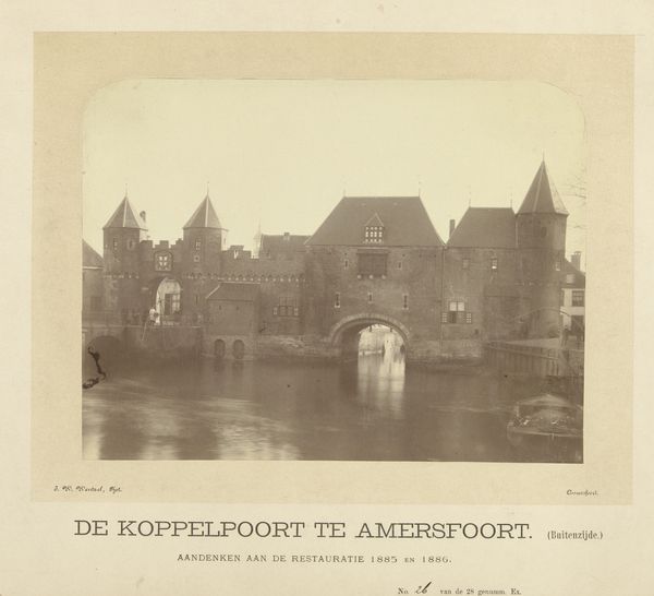
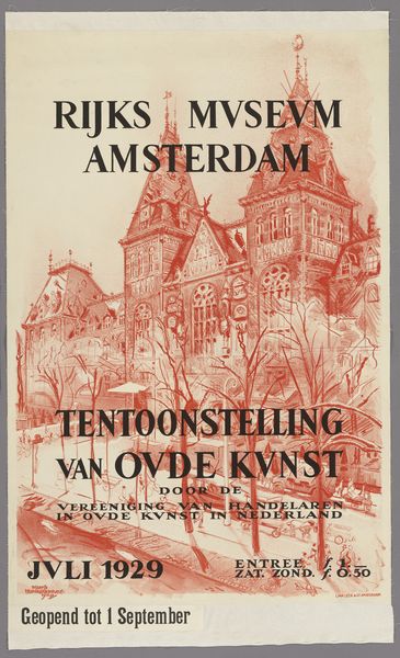
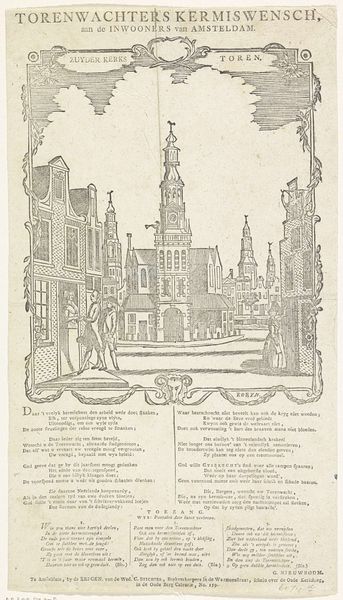
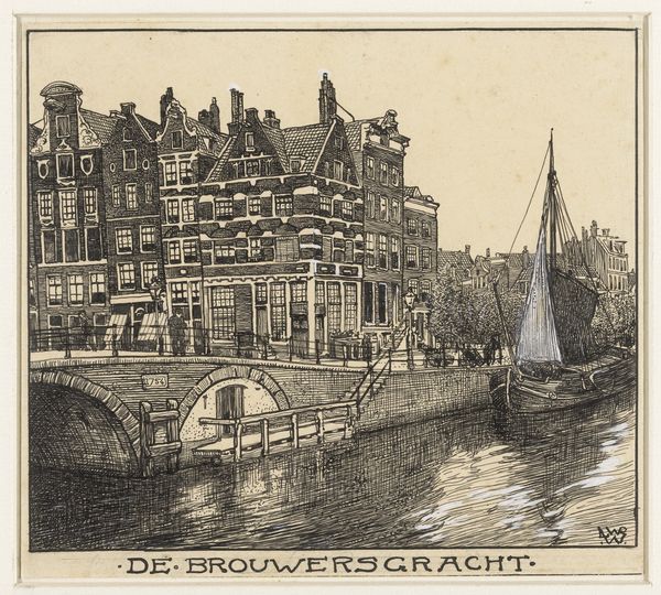
print, textile, typography, poster
#
art-nouveau
# print
#
textile
#
typography
#
poster
Dimensions: height 26.2 cm, width 20.6 cm
Copyright: Rijks Museum: Open Domain
This 'Pamflet' was produced in Amsterdam in March 1919 by the Gemeentebestuur, the municipal authority. It’s an instruction about selling fresh bread, or rather, a prohibition on selling it before 11 a.m. What strikes me is the use of typography as a visual language. The bold, blocky letters have a real presence. This is like a painting, or printmaking, but with words instead of images. The texture is smooth, the colours are muted and utilitarian, and the marks are clean, precise and yet somehow human. It’s a set of instructions that become a kind of poetry. I love the way it balances clarity with a kind of stark beauty. You might almost think of early Constructivist art, but, here, it’s applied to something so everyday. This simple document reminds us that art is not just in museums or galleries, it is all around us. It blurs the line between practical information and visual expression. So, while this isn't a Malevich or Lissitzky, it's still part of that conversation.
Comments
No comments
Be the first to comment and join the conversation on the ultimate creative platform.
More like this