graphic-art, print
#
graphic-art
#
dutch-golden-age
# print
#
symbolism
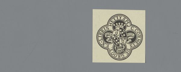
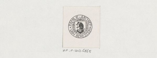
Dimensions: height 98 mm, width 98 mm
Copyright: Rijks Museum: Open Domain
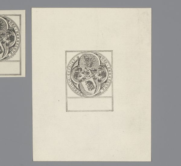
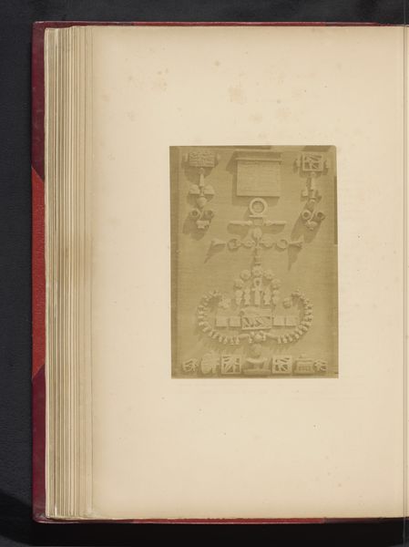
Editor: Here we have an ex libris print by an anonymous artist, likely created sometime between 1886 and 1946. It's quite striking in its simplicity; a lion rampant dominating the composition, surrounded by text. What formal elements jump out at you? Curator: Initially, the strong geometric structure immediately impresses itself upon the eye, circumscribing the heraldic lion. Note how the rigidity of the lines contrasts with the organic dynamism of the lion, which contributes to a certain tension in the composition. Consider the interplay between positive and negative space, specifically how the solid black form of the lion and typography plays against the stark white ground of the print. Editor: That's interesting! I hadn’t thought about that tension. Are the framing lines significant in other ways, like in terms of how they relate to semiotics or even structuralism? Curator: The bordering frame invites one to consider the structural properties of the artwork and how they contribute to meaning. The vertical and horizontal lines delineate space into discrete compartments, which allows a reading of the different components. Through the structured separation, there is semantic content within and also in relation to that imposed ordering device. What does this suggest to you? Editor: Perhaps that order imposed within the personal context and a reflection on both boundaries and relationships? I'll certainly look more deeply now. Thanks for clarifying the construction; I am walking away seeing new relationships. Curator: A deeper visual reading enriches interpretation by emphasizing the constitutive structure and ordering devices of its composition.
Comments
No comments
Be the first to comment and join the conversation on the ultimate creative platform.
More like this