Copyright: National Gallery of Art: CC0 1.0
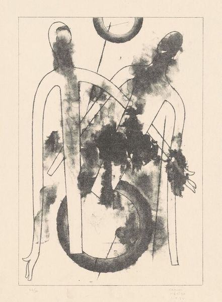
Tadashi Nakayama made this lithograph, Two Horses, in 1988, using ink and a touch of gold. It’s all about the line. Nakayama's mark-making reminds me of Cy Twombly’s scribbles, but with this Japanese calligraphic quality, each stroke feels decisive, even when the overall effect is loose and free. The ink is mostly black, punctuated with these rhythmic splatters down the center of the horses’ bodies, and then restrained within a grid of gold lines. The surface is flat, emphasizing the graphic nature of the print, but that rawness of the ink creates a great tension. The heads are especially interesting, tilting towards one another like figures caught in a dance. It’s like he's channeling something primal through these animals. I see echoes of Franz Marc in the way Nakayama uses animals to express something beyond the merely representational; a deeper, more instinctual understanding of the world.
Comments
No comments
Be the first to comment and join the conversation on the ultimate creative platform.
