print, engraving
#
portrait
#
baroque
# print
#
old engraving style
#
engraving
Dimensions: height 201 mm, width 163 mm
Copyright: Rijks Museum: Open Domain
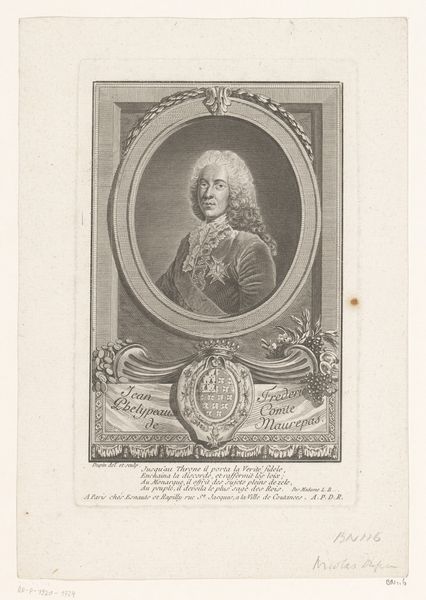
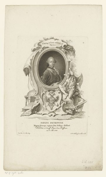
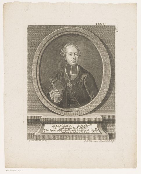
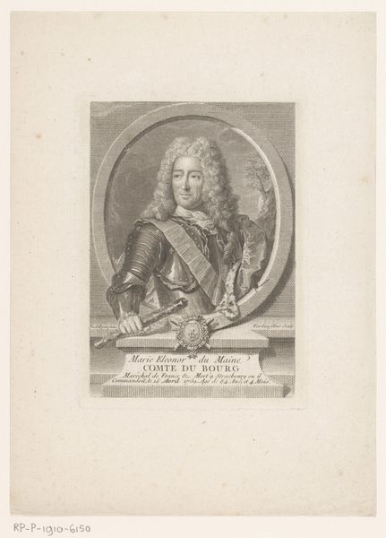
Editor: So, here we have a portrait of Willem IV, Prince of Orange-Nassau, crafted between 1738 and 1751 by Noach van der Meer I. It’s an engraving, which gives it a delicate, almost ethereal quality. It looks so elaborate! What is your impression of it? Curator: Note how the engraving employs the baroque style not just for its decorative elements but in its structural choices. The swirling forms of the frame, for example, echo the Prince's own elaborate wig. The formal lines guide the viewer's eye directly to the profile, where the crisp etching technique defines his features. Have you noticed the symbolic framing around the portrait? Editor: Yes, the frame is incredibly ornate! I can see what looks like cherubs. So the embellishments aren’t arbitrary then? Curator: Precisely. Observe how the engraver utilizes the line—its thickness and direction—to create visual texture and suggest depth. Each element works in concert; nothing is superfluous. How would you say that contributes to the overall composition? Editor: It really pulls the eye into the centre of the work. All of that detail creates a focal point around Willem's face. The quality of the lines gives him definition, too, even though the artwork itself doesn’t have a large tonal range. It also enhances his importance, I guess! Curator: Indeed. By understanding these formal relationships, we reveal not just artistic intention, but the artist’s complete structural and aesthetic argument. Editor: This has changed my perspective a lot. Paying closer attention to the different features of the portrait makes the viewing experience much more rewarding. Curator: And by decoding these artistic languages, we perceive both aesthetic strategy and cultural meaning.
Comments
No comments
Be the first to comment and join the conversation on the ultimate creative platform.
More like this