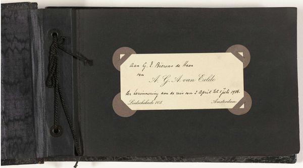
Huwelijksreis van Henry Pauw van Wieldrecht en Johanna Elisabeth Boissevain in 1903 naar Italië, Oostenrijk en Duitsland 1903
0:00
0:00
#
aged paper
#
toned paper
#
water colours
#
ink paper printed
#
personal sketchbook
#
fading type
#
coloured pencil
#
watercolour bleed
#
watercolour illustration
#
watercolor
Dimensions: height 320 mm, width 530 mm, thickness 55 mm
Copyright: Rijks Museum: Open Domain
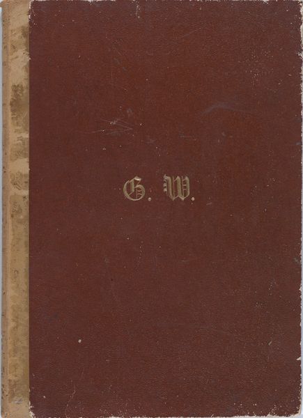
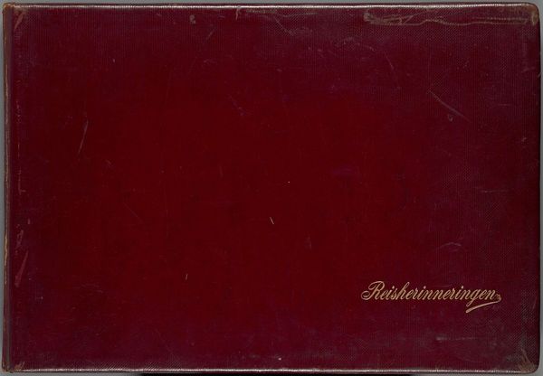
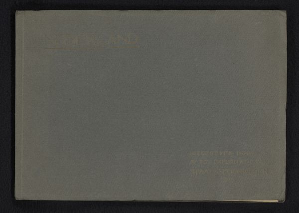
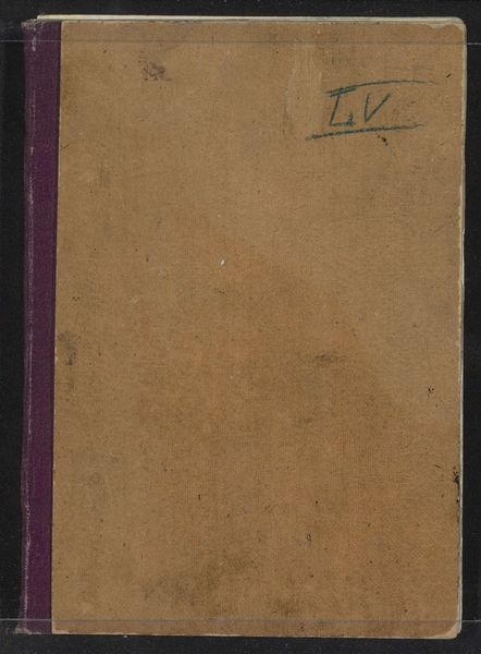
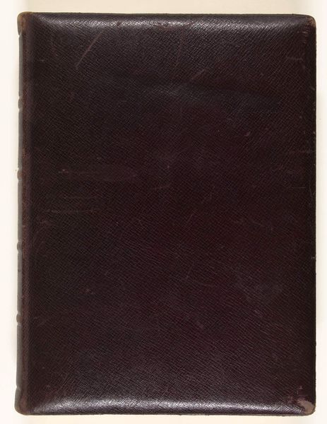
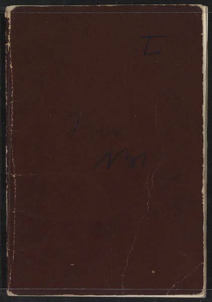
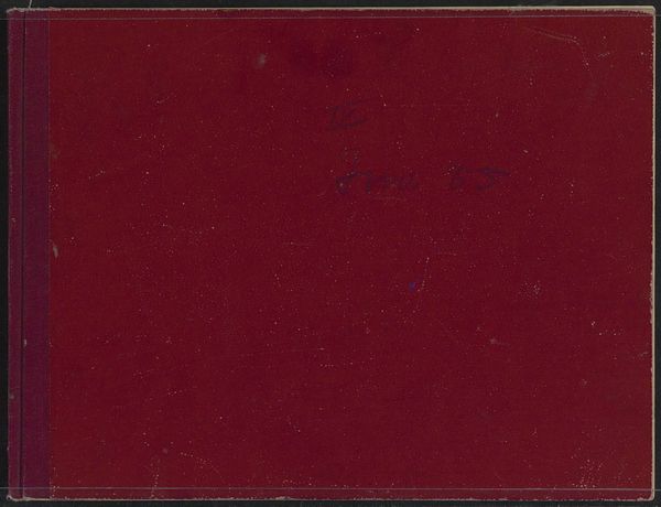
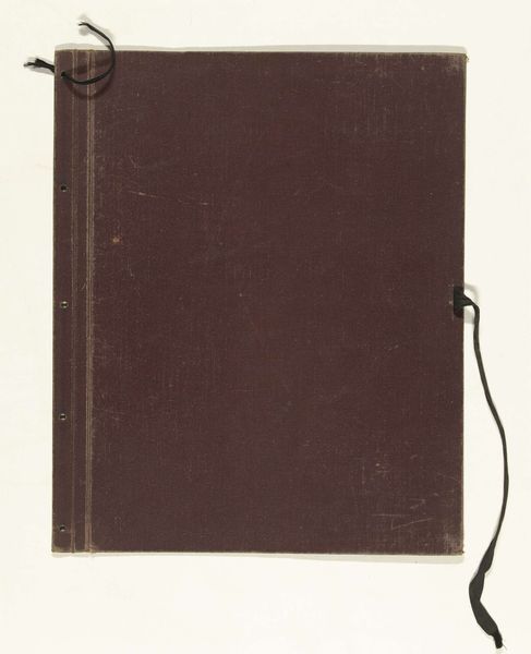
Editor: Here we have “Huwelijksreis van Henry Pauw van Wieldrecht en Johanna Elisabeth Boissevain in 1903 naar Italië, Oostenrijk en Duitsland,” or “Wedding trip of Henry Pauw van Wieldrecht and Johanna Elisabeth Boissevain in 1903 to Italy, Austria and Germany,” created in 1903. It seems to be a personal sketchbook with watercolors, coloured pencil, and ink on paper. It looks so old, it looks like something from my grandparent's attic. What catches your eye when you examine this piece? Curator: The book’s materiality is certainly noteworthy. The combination of what seems to be aged paper, fading type, watercolour bleed, and toned paper suggests a conscious exploration of the interaction between textual and visual elements. Consider the cover itself: how does the binding relate to the typography? Editor: That’s a good point. It appears the maroon book cover contrasts against the dark brown spine of the book, but how would you analyze the gold lettering embossed into the cover? Curator: Notice how the fading, gold type, listing names and a date, interacts with the subdued maroon texture of the book. It signifies the union of individual identity, Johanna and Henry, while being forever framed by the physical limitations inherent in time and materials. Consider too, the visible wear and tear on the corners of the binding, signifying use. Editor: The composition feels very considered, from the color choices to the contrast of textures and the placement of the faded gold text. So, it's not just a random collection of materials but a deliberate construction meant to communicate specific ideas and feelings related to time, memory, and identity. Thank you. Curator: Precisely. Approaching art as a study of intrinsic qualities such as composition, material interaction, and structure allows us a fuller experience, and deeper appreciation.
Comments
No comments
Be the first to comment and join the conversation on the ultimate creative platform.
More like this