1700 - 1725
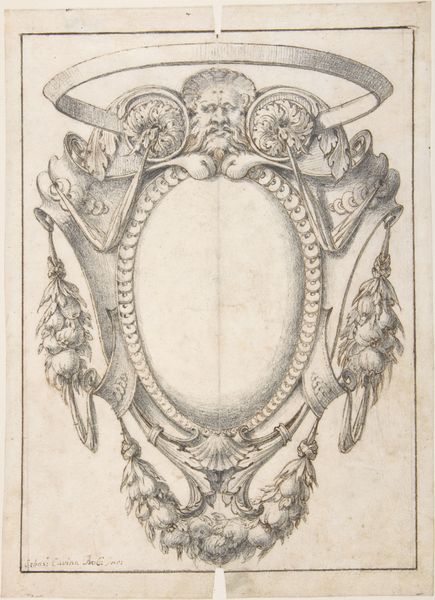
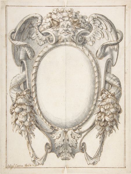
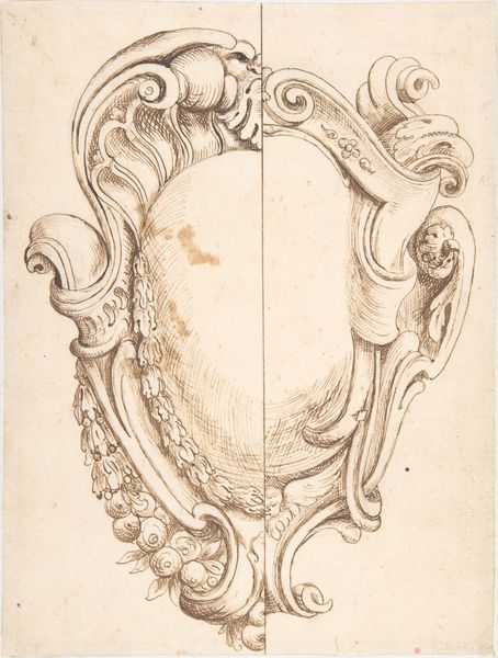
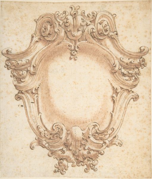
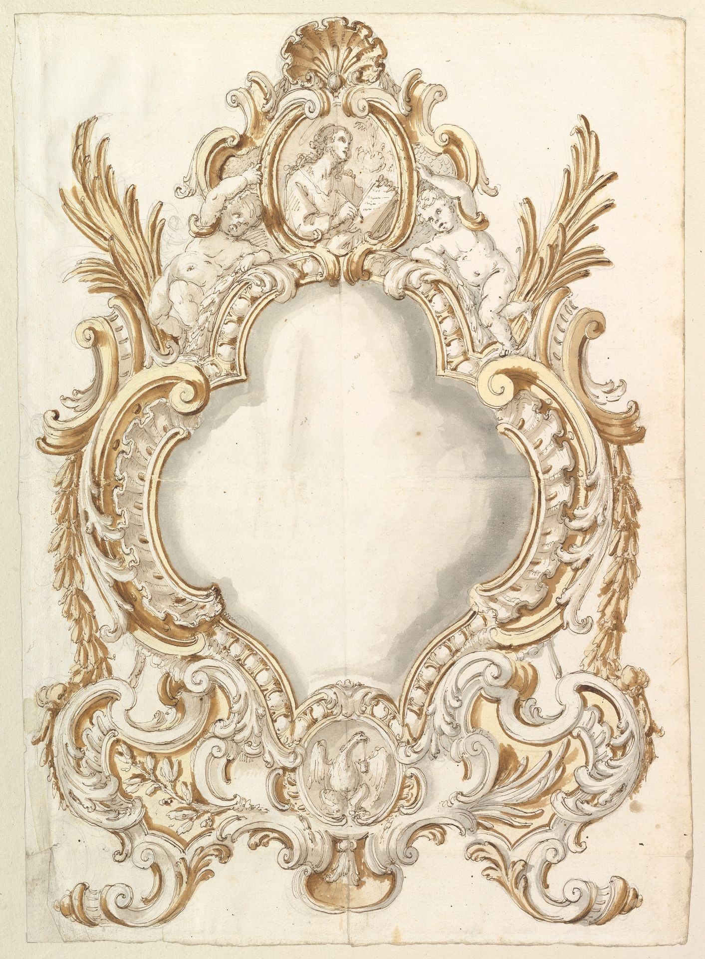
Design for a Carta Gloria
Listen to curator's interpretation
Curatorial notes
Curator: Welcome. Before us is an exquisite "Design for a Carta Gloria," an artwork created by an anonymous hand, sometime between 1700 and 1725. It's a compelling example of Baroque artistry, rendered with pen, pencil, and watercolor. Editor: Immediately, I'm struck by the level of ornate detail. It seems almost impossibly intricate—all these flourishes, the putti, the stylized shell at the top. What's the intended function, the original purpose of such a drawing? Curator: "Carta Gloria," literally a "Chart of Glory," served as elaborate decorations, often temporary constructions, for celebratory or commemorative occasions. These designs offered visual and symbolic expressions of power and triumph, popular during the Baroque era. Editor: So this is essentially a blueprint. I'm curious about the labor involved in producing the actual three-dimensional piece if that’s what was made. Someone would need to interpret these delicate lines, transfer that vision into physical form. The social and economic systems propping this. Curator: The artistry is evident not only in the skillful application of the media, but also in the strategic arrangement of the elements. The symmetry, the calculated rhythm of the curves, all direct the eye toward the absent central element. What would have been depicted in that space? Editor: An absent center seems almost deliberate, drawing all of this decorative excess to frame the unseen, maybe hinting at a figure central to the Baroque aristocratic project. A figure so divine, to the elite, or so beyond everyday comprehension it requires absence. Curator: Precisely. The design functions as both a framework and a symbolic language, articulating power through visual excess and symbolic vocabulary. The materials – ink, wash, paper – allow for a remarkable translation of an imagined monument into an immediate, portable form. Editor: But how does the relative cost and availability of paper at the time inform our reading of this? Was this design intended for broader consumption through print, or meant only for elite eyes involved in its realization? This context transforms how we interpret the work's meaning. Curator: These are valuable considerations, bringing the social realities into sharper focus. Thank you. Editor: Thanks. Thinking about who labored, how it was made, is how design speaks—silently yet strongly.