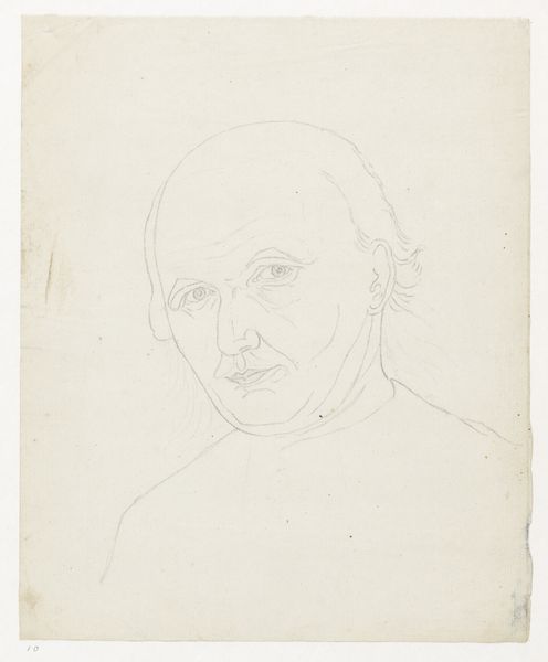
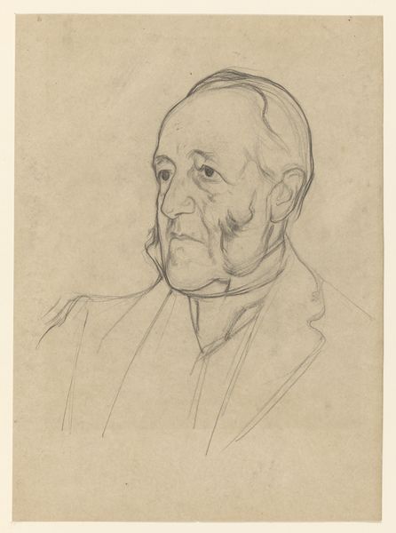
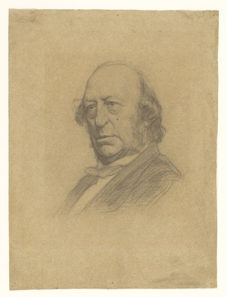
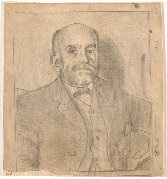
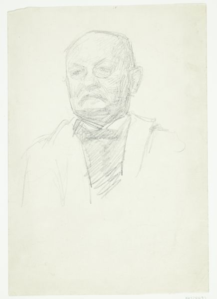
drawing, pencil
#
portrait
#
drawing
#
pencil drawing
#
pencil
#
portrait drawing
#
realism
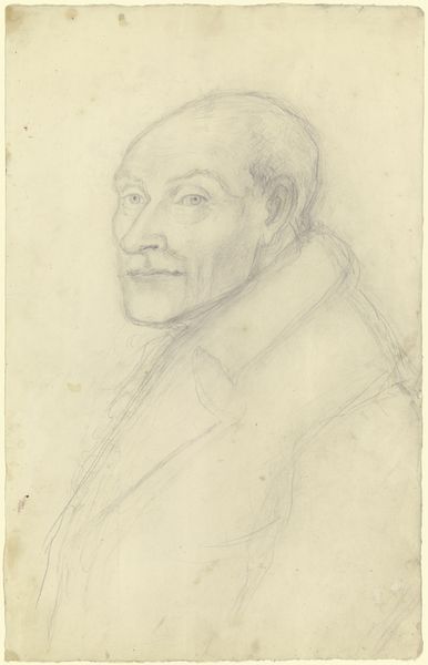
Dimensions: height 309 mm, width 225 mm
Copyright: Rijks Museum: Open Domain
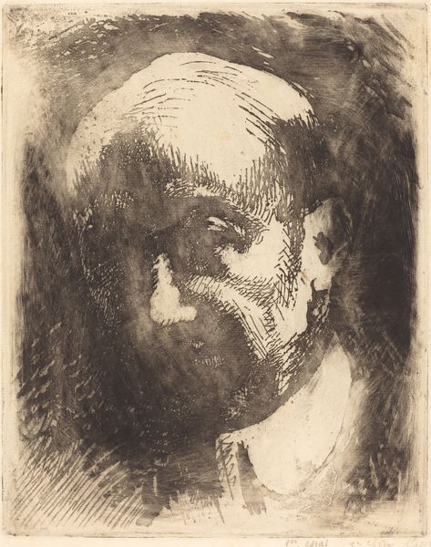
Editor: This is a pencil drawing, "Portret van Nicolaas Beets" by Jan Veth, created between 1874 and 1925. The subject’s gaze is quite direct, almost unsettling. How do you interpret this portrait? Curator: Let’s focus on the formal elements. The artist's command of light and shadow is immediately apparent. Note how Veth uses dense, almost scribbled marks in the background, creating a stark contrast against the smoother, more delicate lines that define the subject's face. Editor: It looks almost like he quickly sketched the face. Curator: Precisely, consider how the contrast between the meticulously rendered facial features and the hazier, more energetic background contributes to the overall dynamism of the piece. Veth seems less concerned with perfect representation, and more interested in conveying the essential forms, the underlying structure of the subject. What do you observe about the texture created through the artist’s mark-making? Editor: Well, I see that some parts of the drawing are almost smudged, giving it a soft and aged quality, but it's not consistent, and seems like he was trying different ways to create different effects. Curator: Yes, it gives it an overall depth and a range of tone. Notice the diagonal lines at the very upper left corner as well. What would you say they contribute? Editor: The lines are isolated and separate from the central object, like Veth wanted to include, but then distract. I feel that's important because you mentioned structure, it's part of how he saw the composition as a whole, including imperfections. Curator: Indeed, it allows one to see the intrinsic properties of the work, without the need for symbolic interpretation or historic placement. Focusing on structure has its advantages, I would argue. Editor: I hadn't thought of it that way before! Analyzing the texture and contrasting lines definitely gave me a new appreciation for the artwork, and helps you imagine his working process.
Comments
No comments
Be the first to comment and join the conversation on the ultimate creative platform.
More like this