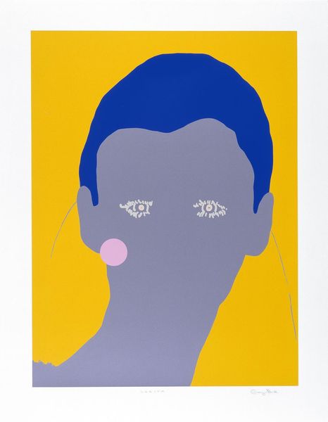
Copyright: Gary Hume,Fair Use
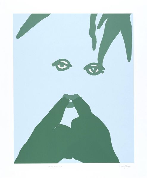
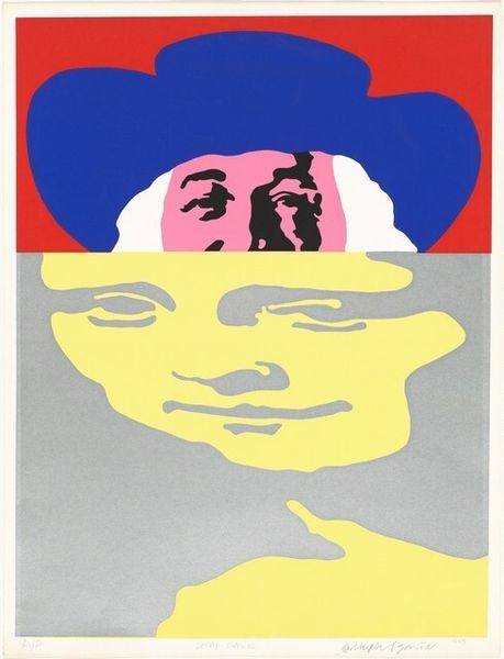
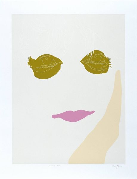
Gary Hume made this striking print, Francis Bacon, sometime after 1962, though I can’t say exactly when or how. Hume has a real knack for distilling figures down to their essence, a process of simplification that's anything but simple. Look at the way Hume uses color and shape, the flat planes of color pressing up against each other, creating a kind of visual tension. The stark yellow of the eyes against the brown of the face, the red of the lips – it's all so direct, so immediate. I'm really drawn to the lines around the eyes, they give the sitter this quizzical, almost confrontational look. They are kind of floating on the face, and also they look a bit like a Nike swoosh! Hume's work reminds me a little of Alex Katz, or maybe even a bit of Elizabeth Peyton. It's all about flattening and simplifying, about capturing a mood or an essence with the fewest possible gestures.
Comments
No comments
Be the first to comment and join the conversation on the ultimate creative platform.