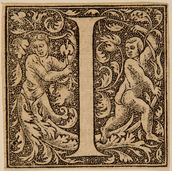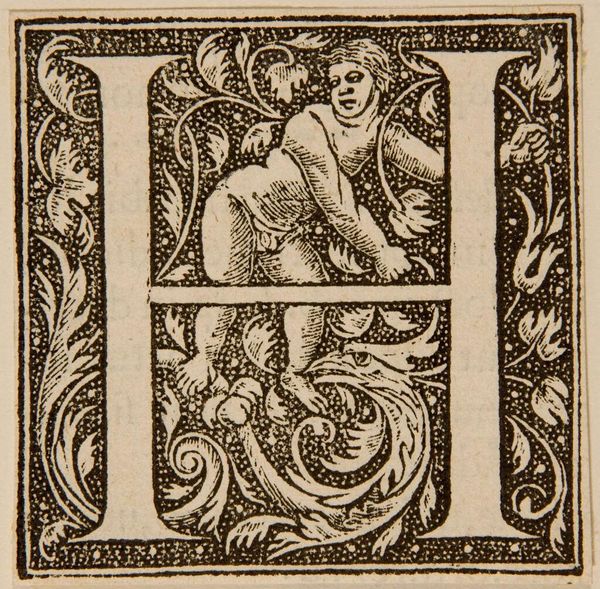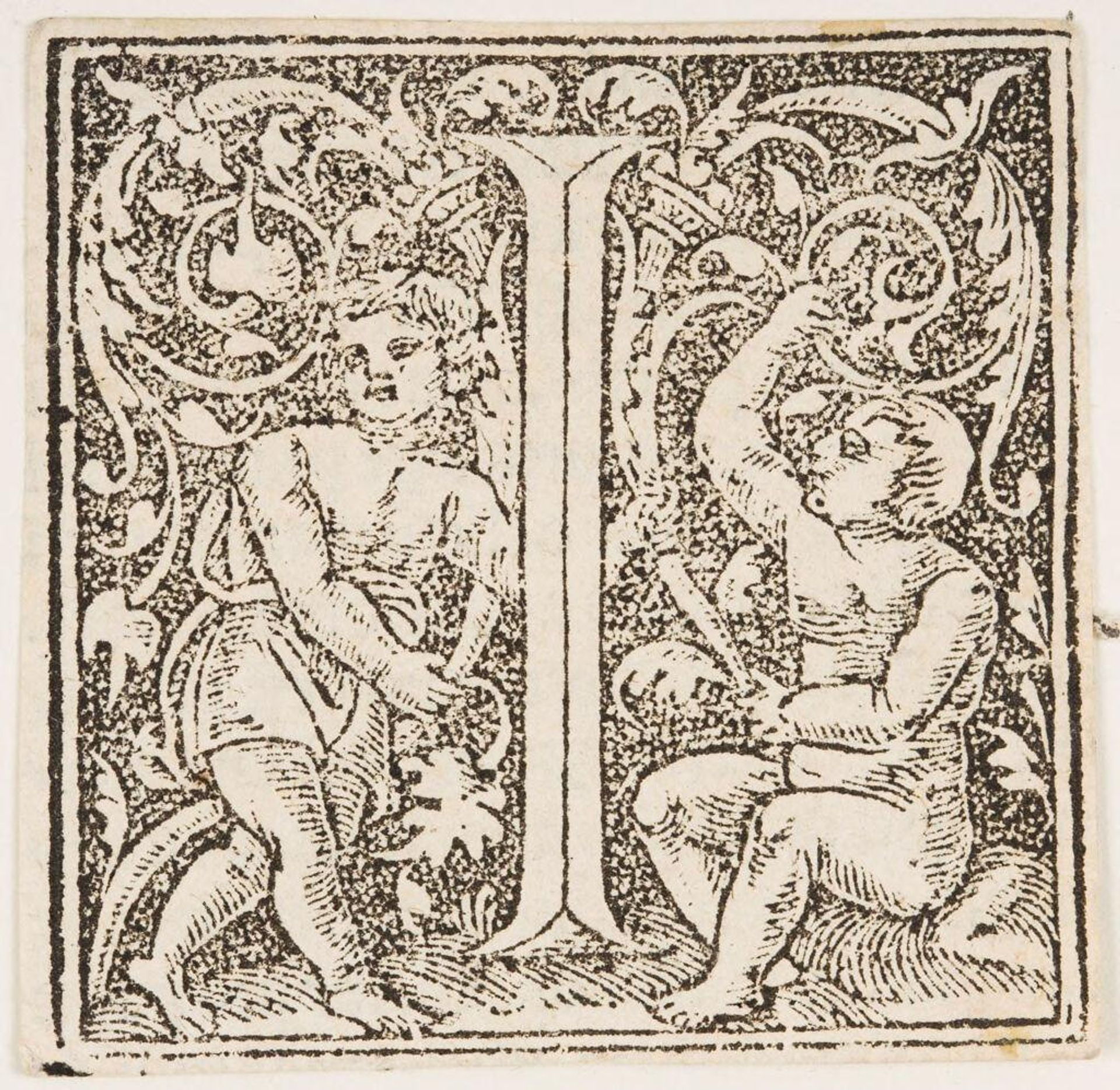
c. 16th century
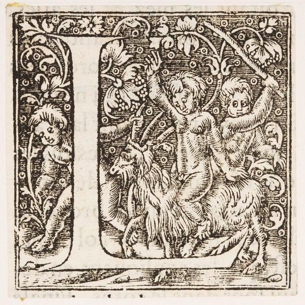
Letter I
Listen to curator's interpretation
Curatorial notes
Editor: This woodcut, "Letter I," is by an anonymous artist and it's housed at the Harvard Art Museums. I'm struck by the contrast between the solid letterform and the busy detail around it. What do you see in the composition? Curator: The density of the foliage surrounding the letterform creates a tension, a visual push and pull. Note how the figures, positioned asymmetrically, animate the otherwise static letter. Editor: So, the placement of the figures and the dense foliage are not just decorative but contribute to the overall dynamism? Curator: Precisely. Consider the lines, their thickness and direction; how they define form and create texture. The artist uses them to establish a clear visual hierarchy, wouldn't you agree? Editor: I do. I see how the line work directs the eye and gives the image depth. Thanks for pointing that out! Curator: My pleasure. I'm glad we could unravel the visual language of this piece together.