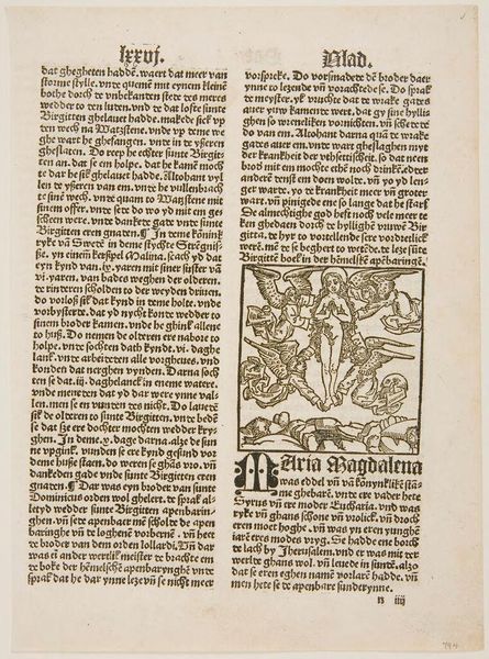
print, typography
#
script typeface
#
dutch-golden-age
# print
#
small type
#
editorial typography
#
text
#
typography
#
newspaper layout
#
stylized text
#
thick font
#
handwritten font
#
word imagery
#
columned text
#
small lettering
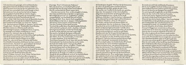
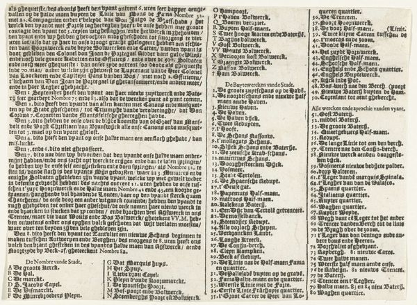
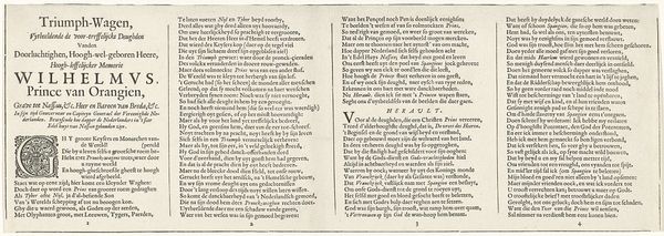
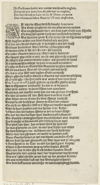
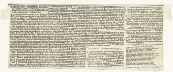
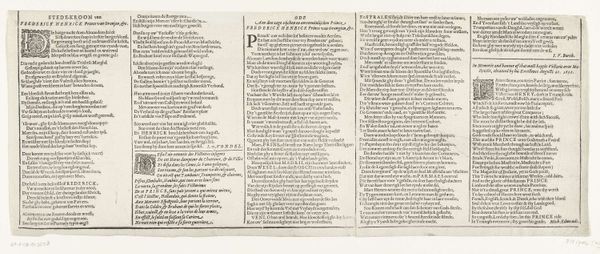
Dimensions: height 129 mm, width 465 mm
Copyright: Rijks Museum: Open Domain
Editor: Here we have "Tekstblad behorend bij Het Arminiaans Testament, 1618," created by Claes Jansz. Visscher. It's a print, featuring dense typography. The sheer amount of text is striking. What story do you think the materials and construction tell here? Curator: As a print, it speaks volumes about accessibility and dissemination. Think about it: In 1618, this wasn’t just information; it was a tool. What was the printing process like then? How did its materiality affect the reception of this “Arminian Testament?" Editor: That’s a good point. Printing made it much more accessible than a hand-written manuscript. But it seems designed more for distribution than careful reading. It's like propaganda. Curator: Precisely! The choice of typeface, the layout… all deliberate acts. It reflects the cultural context. Who controlled the printing presses? What were the dominant social narratives being pushed, and what alternative narratives did the material processes create? Editor: I see what you mean. Even the quality of the paper would say something about its intended audience and longevity. Was this meant to be ephemeral or something more lasting? Curator: Exactly. Look closer. Does the ink seem consistently applied? Are there imperfections in the paper? These aren't flaws, but evidence of labor and production constraints, hinting at the social and economic realities of 17th-century Dutch society. How would a richly decorated, illustrated version compare, in terms of cost and intended audience? Editor: This makes me look at it differently now. I wasn't even thinking about the paper itself having a context. It’s not just words; it’s a physical object loaded with social and political implications. Curator: And how the choices behind its materials – paper, ink, printing methods - played a pivotal role in its message. Materiality reveals more than aesthetics, it reveals power dynamics.
Comments
No comments
Be the first to comment and join the conversation on the ultimate creative platform.
More like this