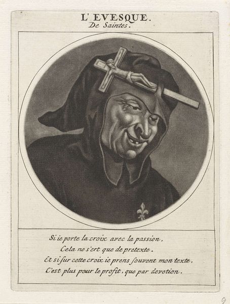
engraving
#
portrait
#
baroque
#
old engraving style
#
engraving
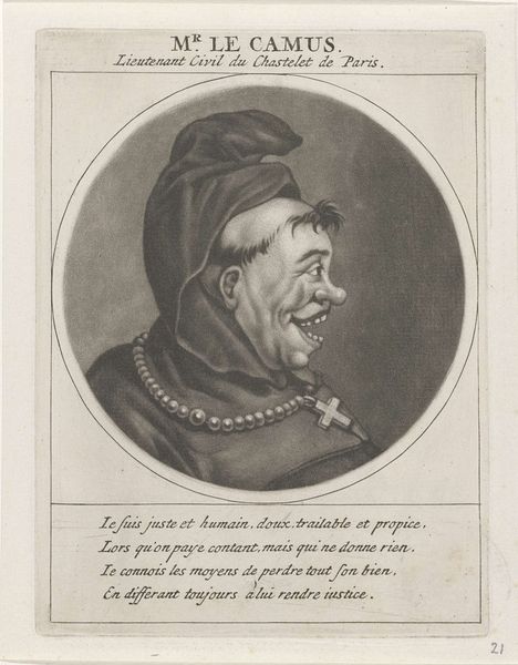
Dimensions: height 146 mm, width 107 mm
Copyright: Rijks Museum: Open Domain
Curator: Let's discuss Jacob Gole's 1691 engraving, "Portret van Madame de Maintenon," housed at the Rijksmuseum. Editor: My first impression is, honestly, shock. The exaggerated expression, the almost grotesque rendering—it seems far from flattering, creating a caricature rather than a portrait. Curator: Indeed. Gole manipulates line and shadow in a bold, almost theatrical manner. Observe the hatching technique; it's far from subtle. He uses densely packed lines to create areas of deep shadow, particularly around the eyes and mouth, lending to the image's intensity. The circular framing enhances the feeling of constraint, wouldn’t you say? Editor: Absolutely, but let’s consider *who* Madame de Maintenon was—the second wife of Louis XIV. She went from being a governess to one of the most powerful women in France. This portrait, with its emphasis on what we might politely call “unconventional beauty,” could be a deliberate commentary on her social climbing and perceived manipulation. The inscription seems to corroborate this idea. Curator: Precisely. Semiotically, her adornments offer another avenue to deconstruct this engraving. The crucifix she’s wearing could symbolize both her religious fervor and the piety she promoted at court. Yet, coupled with this unflattering representation, could these devotional tokens reveal a level of constructed or imposed piety? Editor: A necessary attribute given her position, perhaps? The text underneath translates to something like: "I must incontestably be joined in league...as a widow of Scarron, I am now the wife of a King: And if I succeeded, it's by my sole intrigue.” The artist essentially gives her the last word and suggests ambition motivated her rise, challenging idealized portraits of women at the time. Curator: And the text appears under the subject as though they wrote it themselves. That detail, alongside the baroque flourishes surrounding the portrait, indicates a fascinating tension between realistic features and overt flattery—both meant to represent and reveal character. Editor: Well, seeing this challenges our idea of historical depictions of women. It is useful to deconstruct dominant power structures using depictions like these and use our contemporary lens. I like what this reveals. Curator: And that subversion through skillful graphic design, coupled with a direct quotation—is rather enduring.
Comments
No comments
Be the first to comment and join the conversation on the ultimate creative platform.
More like this