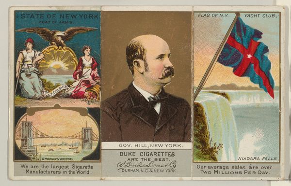
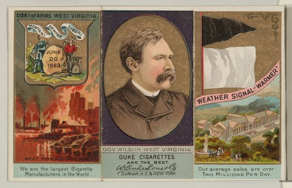
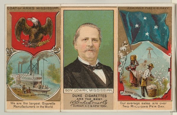
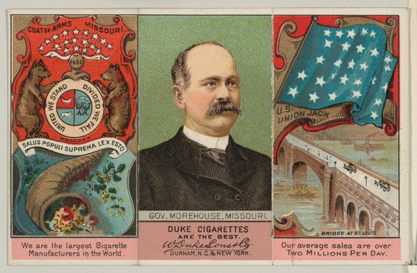
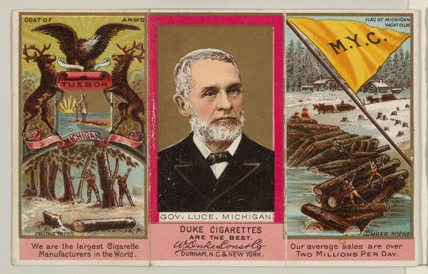
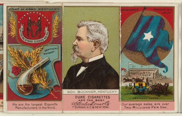
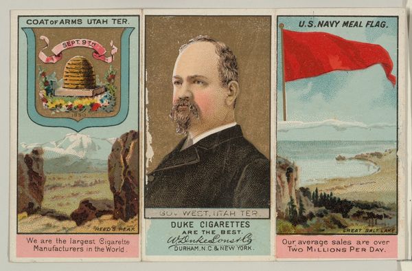
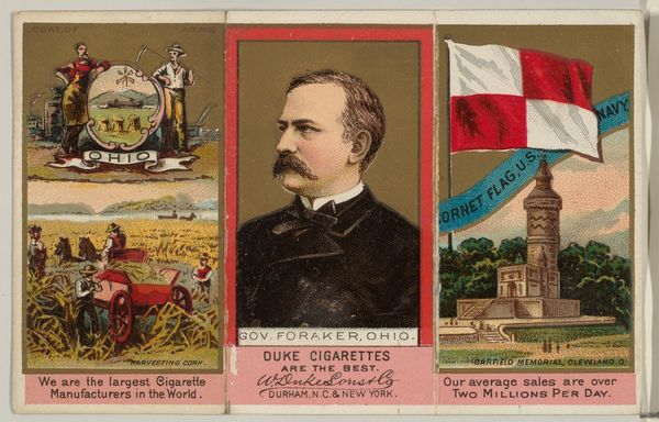
Governor Lee, Virginia, from "Governors, Arms, Etc." series (N133-2), issued by Duke Sons & Co. 1885 - 1892
0:00
0:00
drawing, lithograph, print
#
portrait
#
drawing
#
lithograph
# print
#
men
Dimensions: Sheet (unfolded): 2 3/4 × 4 5/16 in. (7 × 11 cm) Sheet (folded): 2 3/4 × 1 3/8 in. (7 × 3.5 cm)
Copyright: Public Domain
Editor: Here we have a lithograph print, “Governor Lee, Virginia, from ‘Governors, Arms, Etc.’ series,” made by W. Duke, Sons & Co. sometime between 1885 and 1892. It has a somewhat disjointed feel with the combination of images, text, and different stylistic approaches, creating a complex composition. How would you interpret the arrangement of visual elements in this piece? Curator: Let us begin with its tripartite structure. Three distinct panels: the state arms, Governor Lee’s portrait, and what appears to be a somewhat stereotypical image coupled with commercial boasting on either end. Note the central figure’s static pose—rigid, authoritative, offset by the dynamism on the left and the arguably condescending tableau on the right, don't you think? How do you feel that structure guides your eye? Editor: I see what you mean, with the portrait as a focal point. And, yes, there's a dissonance created by the varying degrees of visual complexity and racial presentation. It almost feels like three separate artworks awkwardly placed together. What significance do you see in the graphic elements versus the portrait itself? Curator: The graphic elements—the coat of arms, the agricultural figure, the U.S. Revenue flag—they provide context, location and aspirations, while the portrait aims to bestow upon this commercial piece some respectability. It creates a tension, doesn’t it? The commercial brazenness with these high-minded associations, quite unsettling in its bold assembly of potentially opposing ideas. What do you make of it? Editor: It’s like the artist is intentionally using those different visual and symbolic languages to create a commentary on society, commerce, and even race relations. Thank you, I’m finding that I appreciate the complexity even more. Curator: Indeed. The apparent cacophony of discordant elements, through its tension and juxtaposition, reveals more about late nineteenth-century aspirations. Food for thought, eh?
Comments
No comments
Be the first to comment and join the conversation on the ultimate creative platform.
More like this