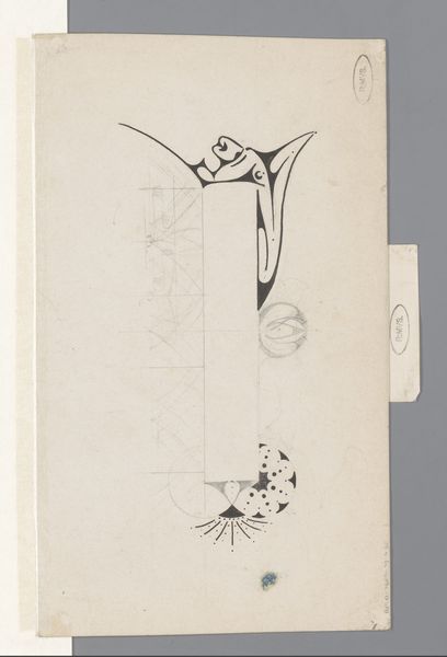
Ontwerp voor een advertentie van Het Modehuis te Soest 1884 - 1952
0:00
0:00
drawing, paper, typography, pencil
#
drawing
#
light pencil work
#
art-nouveau
#
script typography
#
sketch book
#
hand drawn type
#
personal journal design
#
paper
#
personal sketchbook
#
typography
#
hand-drawn typeface
#
pen-ink sketch
#
pencil
#
sketchbook drawing
#
sketchbook art
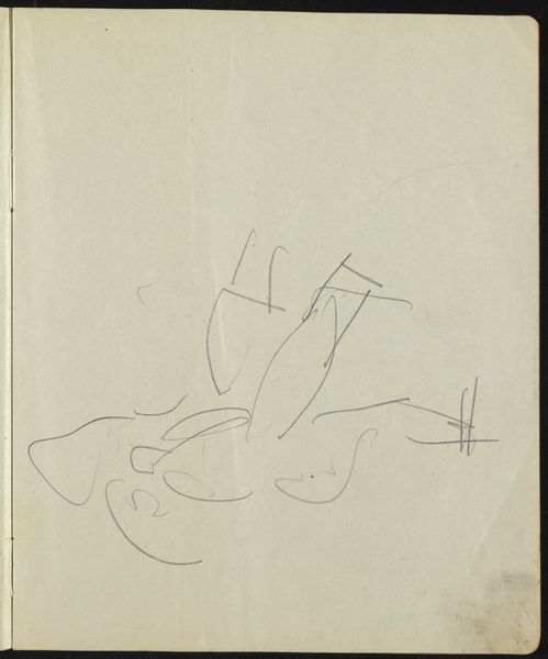
Dimensions: height 140 mm, width 99 mm
Copyright: Rijks Museum: Open Domain
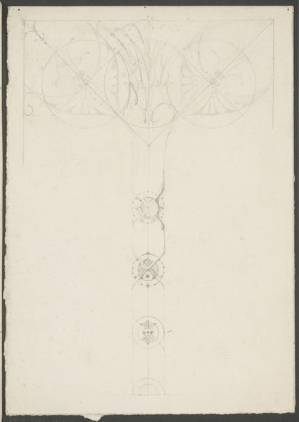
Reinier Willem Petrus de Vries made this advertisement design for Het Modehuis in Soest with pencil on paper. The initial design strikes me as a game of seeing and composing. The most noticeable feature is the woman whose torso is only suggested, adorned with an elaborate collar like some kind of radiant halo. The pencil work here is delicate and precise, but each mark is distinct. You can almost see the artist deciding where to lay down each line, each curve. It's as if the act of drawing becomes a form of thinking. I find the way the design teeters between flat graphic and gentle portrait intriguing, as if Aubrey Beardsley tried his hand at commercial design. Which goes to show, art is never created in a vacuum. It’s always talking to someone else, a constant conversation across time.
Comments
No comments
Be the first to comment and join the conversation on the ultimate creative platform.
More like this