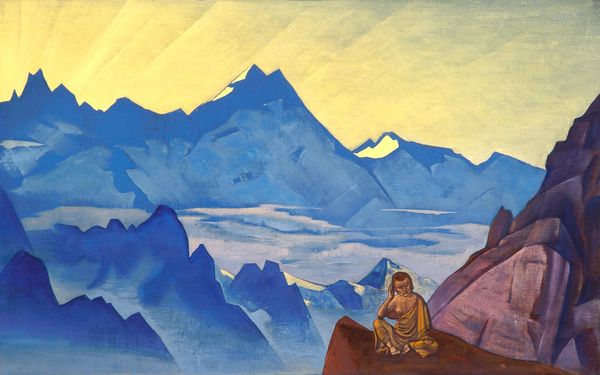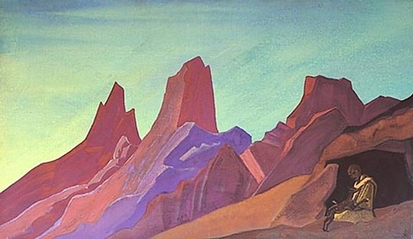
Curatorial notes
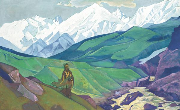
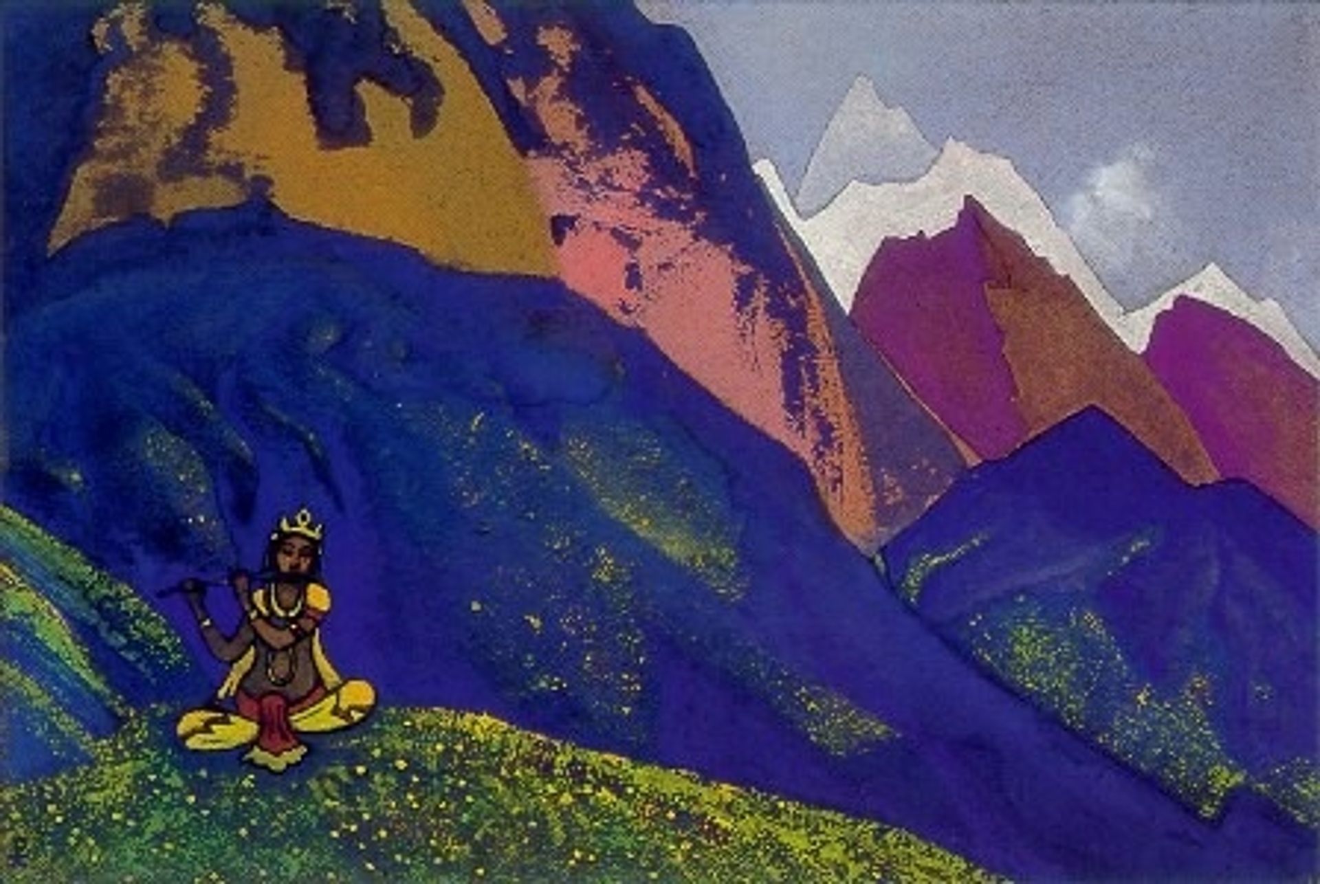
Nicholas Roerich made this painting of Krishna sometime in the 20th century, probably with tempera on board. Just look at those colours! Such a bold palette, right? It’s a great example of an artist unafraid to just go for it, piling the paint on and letting the process guide the way. And the texture! It’s all about the surface here. You can almost feel the ruggedness of the mountains. I am especially drawn to the way Roerich applies the paint in thick layers. See how the ridges and grooves catch the light? It makes the mountains feel almost alive, like they’re breathing. It's as if the paint itself becomes part of the landscape. The little yellow and white dabs of paint in the foreground create this magical shimmering meadow for Krishna. Roerich was clearly tuned into something bigger than just representation. For another mystic landscape check out Hilma af Klint. It’s all about finding a visual language for the invisible, embracing ambiguity, and allowing for multiple readings.