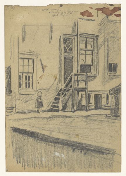
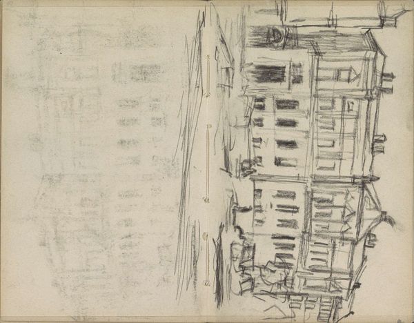
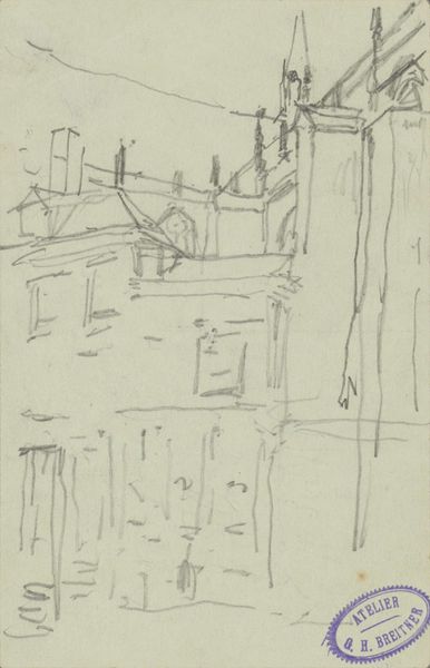
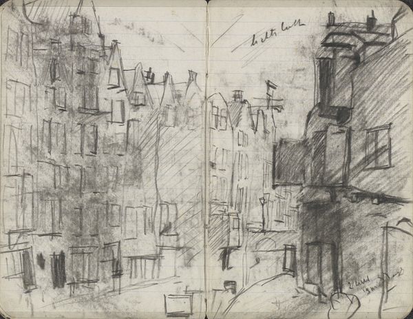
Gezicht op de achterkant van huizen, met kleurnotities 1873 - 1932
0:00
0:00
wilhelmusjohannessteenhoff
Rijksmuseum
drawing, pencil
#
landscape illustration sketch
#
drawing
#
amateur sketch
#
toned paper
#
light pencil work
#
pen sketch
#
pencil sketch
#
sketch book
#
landscape
#
personal sketchbook
#
pen-ink sketch
#
pencil
#
sketchbook drawing
#
cityscape
Dimensions: height 451 mm, width 289 mm
Copyright: Rijks Museum: Open Domain
Curator: Looking at this pencil drawing from the Rijksmuseum’s collection titled "View of the Backs of Houses, with Color Notes," dating from 1873 to 1932, what's your initial take? Editor: Stark, I'd say. And somber. The narrow, verticality emphasizes confinement. All those straight lines pressing inward… Curator: Wilhelmus Johannes Steenhoff executed this cityscape sketch with what seems to be graphite and touches of ink, perhaps in a personal sketchbook. It has that immediacy. Observe how he suggests depth. What compositional elements stand out? Editor: The varying line weights definitely suggest spatial recession, sure. The roughness of the paper texture also does something. But it's clearly the repetition of the rectangular forms themselves, those chimney stacks, drainpipes, and windows that establishes the rhythm and structure. Were these materials readily available to amateur artists at the time? Curator: Certainly. The relative accessibility of paper and pencil meant more individuals could document the everyday world. However, note how Steenhoff subtly destabilizes the rigid geometry through faint tonal variations, injecting light into the composition. It’s not mere replication, but interpretation. Editor: Interpretation, right, like choosing to focus on these unglamorous, back facades. These aren't the stately fronts we normally see celebrated in urban landscapes. It seems he deliberately highlighted the material realities of the urban experience – the infrastructure and construction that went into it all. The means of dwelling. Curator: Precisely, the structural supports themselves are celebrated here, and in some places are actually quite obscured. The subtle use of shadowing is superb as well. Notice that the colour notes written across the drawing add another layer, although we are missing information to fully grasp their meaning. What sort of impact does this lack of clarity create? Editor: Adds a layer of ambiguity, maybe incompleteness – reinforces the drawing’s status as a fleeting study. Though perhaps it underscores how perception itself is always subjective, coded, mediated through material processes like inscription, which in turn creates specific historical perspectives? Curator: It's this provisional quality combined with its formal rigor that intrigues. I agree; it emphasizes Steenhoff's perspective as a fleeting moment captured. Editor: So, while at first the subject matter seemed quite somber to me, focusing on its material production definitely adds a welcome element of historical reflection and specificity. Curator: And conversely, considering the interplay of structure and light encourages closer inspection to what could simply be seen as architectural recording, revealing that is can truly reveal the sensitivity that Steenhoff possessed.
Comments
No comments
Be the first to comment and join the conversation on the ultimate creative platform.
More like this