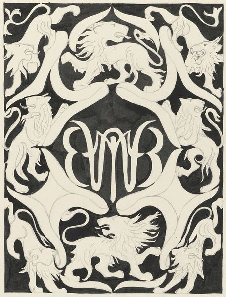
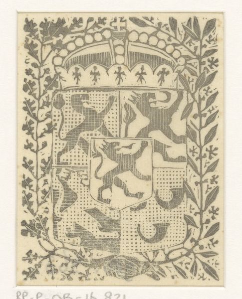
Ontwerp voor een ex libris met monogram en leeuwen 1874 - 1945
0:00
0:00
careladolphlioncachet
Rijksmuseum
graphic-art, print, linocut
#
graphic-art
#
linocut
# print
#
linocut
#
linocut print
#
geometric
#
symbolism
Dimensions: height 404 mm, width 286 mm
Copyright: Rijks Museum: Open Domain
Editor: Here we have Carel Adolph Lion Cachet’s “Design for a bookplate with monogram and lions”, made sometime between 1874 and 1945. It’s a linocut print. I’m really drawn to the stylized depictions of the lions; they create a striking geometric pattern. What stands out to you about its composition? Curator: The artwork is best approached as an exercise in form rather than a representational exercise. Note the interplay between positive and negative space; the gray backdrop isn't just 'empty', but rather it serves as an active element defining the lions and monogram. Also, observe how the rhythm established by the repeating lions’ heads contributes to an overall symmetrical balance, reinforcing the heraldic function. The lines are bold and confident. What effect do you think Cachet achieved through such clarity? Editor: The strong lines give it a really crisp, powerful feel. The way the lions are almost mirror images facing each other adds to that sense of power and formality. It feels very intentional. Curator: Precisely. Intentionality is key. Now, consider the simplified forms; they move away from naturalistic rendering, embracing a more stylized interpretation. We might read the print in relation to principles of semiotics; do you find that the representation successfully signifies "strength" and "heritage"? Editor: Absolutely. The strategic repetition definitely amplifies those readings. Curator: How so? Think of its construction as the use of symbolic forms. Editor: Well, repetition and symmetry create order, suggesting stability. The lions themselves, often seen as symbols of courage, reinforce that, giving us a sense of visual encoding. Curator: A solid interpretation. This work successfully communicates complex ideas of history, power, and even personal identity, all through simplified shapes and confident lines. Its visual components resonate beyond their literal form. Editor: I never thought of it that way before, that visual organization dictates interpretation. Thanks for pointing that out!
Comments
No comments
Be the first to comment and join the conversation on the ultimate creative platform.
More like this