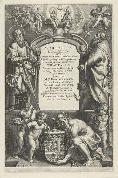
print, engraving
#
baroque
# print
#
figuration
#
line
#
history-painting
#
engraving
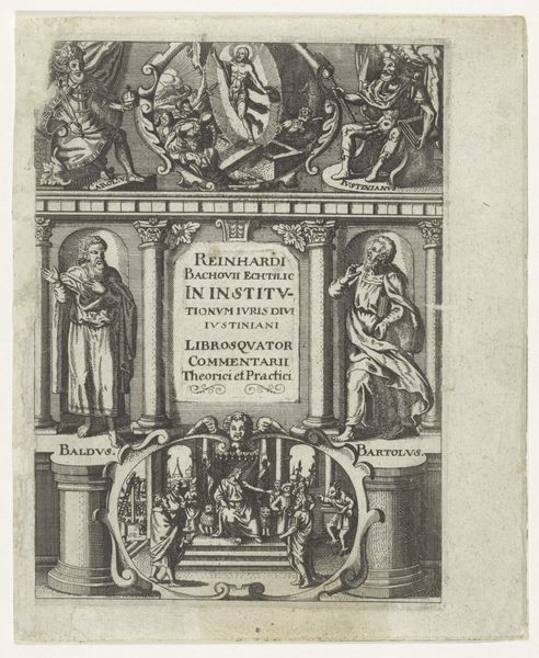
Dimensions: height 183 mm, width 140 mm
Copyright: Rijks Museum: Open Domain
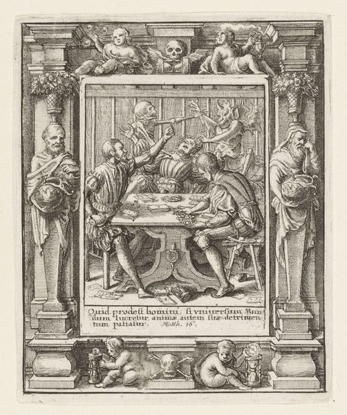
Editor: Here we have Abraham Dircksz. Santvoort’s "Vier evangelisten rond een toegangspoort," an engraving from 1665 housed at the Rijksmuseum. The stark lines and composition give it an architectural and intellectual feel; it looks almost like a bookplate. What are your immediate impressions, seen from your perspective? Curator: Indeed. What strikes me is the balanced yet hierarchical composition. Observe how the architectural framework, seemingly classical, is adorned with figures emblematic of the Evangelists. We can trace the artist’s skillful arrangement of these figures relative to the textual space, a conscious effort in the use of engraving techniques that yield this pronounced contrast. How do you see the relationship between the figural and textual components? Editor: Well, I notice how the title lettering seems to sit forward of the four Evangelists. To me, they look to be flanking, maybe guarding the text. Does the structure evoke meaning in and of itself? Curator: Precisely! Note how Santvoort constructs a visual hierarchy, a semiotic ladder if you will. The clear inscription occupies the central foreground, thus commanding primary attention, while the Evangelists, identifiable through symbolic figures and classical arrangement, support the scriptural theme while contributing an element of artistry to it. What impact does that linear quality have on your understanding of the piece? Editor: It gives a great sense of depth despite the rather flat style, and separates distinct layers. Looking closely at the use of line, the different techniques that make each aspect visually interesting! Curator: Indeed, Santvoort employs varied crosshatching to delineate tonal variations and texture. Notice, the dense concentrations in the upper register, which evoke depth, contrasted to the crisp delineation of the script itself. What has stood out most to you regarding this formal analysis? Editor: I appreciate understanding the way the artist visually balances text and image and arranges them structurally. The lines are sharp, the layout symmetrical but a little chaotic, so all of that communicates in very specific ways.
Comments
No comments
Be the first to comment and join the conversation on the ultimate creative platform.
More like this