drawing, ink
#
drawing
#
dutch-golden-age
#
landscape
#
figuration
#
ink
#
genre-painting
#
realism
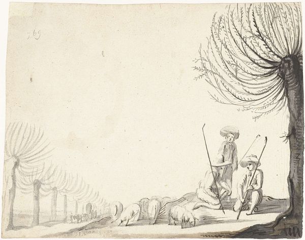
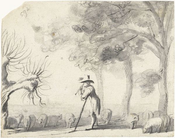
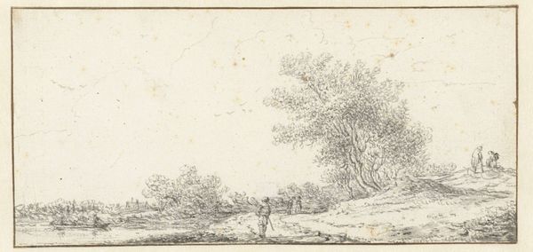
Dimensions: height 161 mm, width 206 mm
Copyright: Rijks Museum: Open Domain
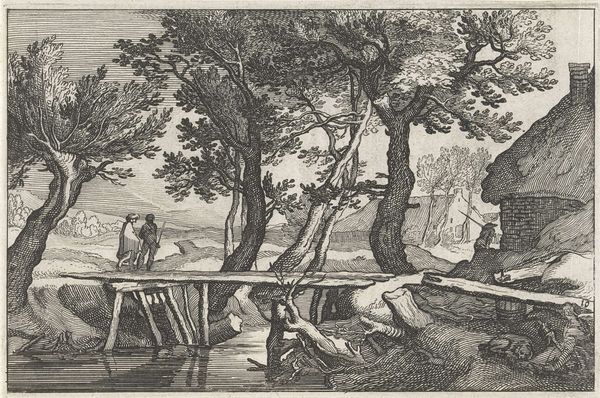
Editor: We're looking at "Herder en zijn kudde lopend op een pad langs bomen," possibly from 1651, by Harmen ter Borch. It's an ink drawing. It feels incredibly serene and simple; the textures created with just ink are so impressive. What do you see in the piece? Curator: The handling of light is certainly key. Notice how the artist uses washes of ink to create depth and volume, particularly in the trees. Ter Borch masterfully contrasts the dense foliage with the more open areas of the path, guiding the viewer’s eye. How do you perceive the relationship between the figures and the landscape? Editor: I think the figures almost blend into the landscape. The shepherd and his sheep are just another element within the trees and path, creating a sense of harmony. Is that intentional? Curator: One could argue it emphasizes the interrelationship between humans and nature. The lack of strong tonal contrast prevents any single element from dominating. What about the lines? How do you interpret their role in shaping the composition? Editor: The lines seem quite loose and gestural, particularly in the leaves. It's not about precision; it is more about capturing the essence of the scene. Curator: Precisely. The seemingly effortless application of the ink contributes to the drawing's overall feeling of immediacy and tranquility. It’s a beautiful example of how simplicity in form can lead to complexity in feeling. Editor: This formal analysis really opens my eyes to details that contribute to the overall feeling. Curator: Indeed. Paying attention to the artist's manipulation of form and line reveals the aesthetic and expressive possibilities.
Comments
No comments
Be the first to comment and join the conversation on the ultimate creative platform.
More like this