engraving
#
portrait
#
baroque
#
old engraving style
#
caricature
#
form
#
portrait reference
#
line
#
portrait drawing
#
history-painting
#
engraving
#
portrait art
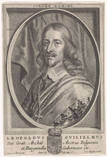
Dimensions: height 175 mm, width 121 mm
Copyright: Rijks Museum: Open Domain
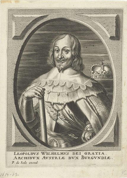
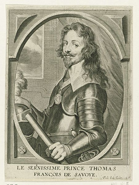
Editor: This is a portrait of Leopold Willem van Oostenrijk, an engraving from the 17th century, credited to Pieter de Jode II. It looks so formal and staged, a typical Baroque depiction of power. What compositional elements stand out to you? Curator: The work is primarily organized around the verticality of Leopold’s figure and the contrasting textures rendered meticulously through the engraving technique. Note how the artist uses line variations to differentiate between the soft texture of his hair, the reflective armor, and the symbolic medallion he holds. How does the composition draw your eye through the artwork? Editor: My eye goes straight to the face, then down to the medallion and the writing around it. Then I start to look at the armor and the details of the background architecture. I'm curious about why his gaze is so… intense? Curator: Indeed. The intensity is largely achieved through the sharp contrast around the eyes and the subtle modeling of the face, all achieved through skillful manipulation of line. Furthermore, the way the lines curve and flow create dynamism, particularly in his hair and the folds of fabric. Have you noticed how the light seems to originate from an unseen source, dramatically illuminating his features? Editor: It does give him a sort of divine glow. It's a very strong image, I'm curious about what choices the artist made when organizing this composition to convey these attributes. Curator: Consider the placement of Leopold within the architectural space, elevated by implication, almost framed. This is not accidental. Also, look at the lines within the image that subtly direct the viewer’s sight towards important symbolic elements. It’s a network of visual cues working together. Editor: That makes sense! It’s not just about representing him, but really constructing an image of authority. I will definitely think more about those formal devices going forward!
Comments
No comments
Be the first to comment and join the conversation on the ultimate creative platform.
More like this