print, gestural-painting, ink
#
abstract-expressionism
# print
#
form
#
gestural-painting
#
ink
#
abstraction
#
monochrome
Copyright: National Gallery of Art: CC0 1.0
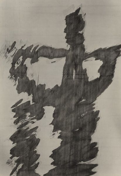
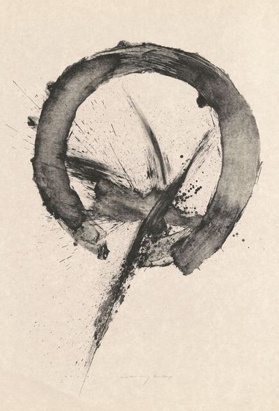
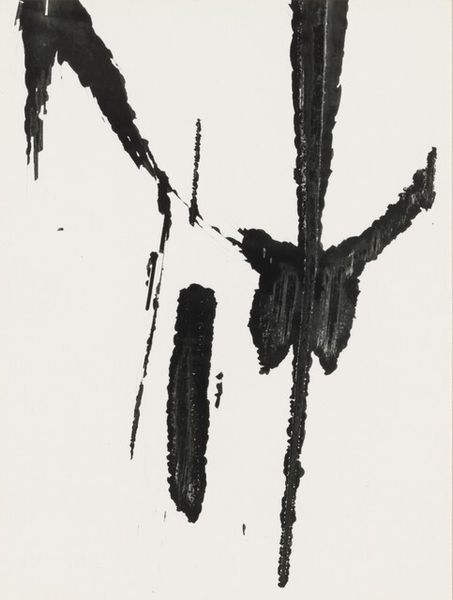
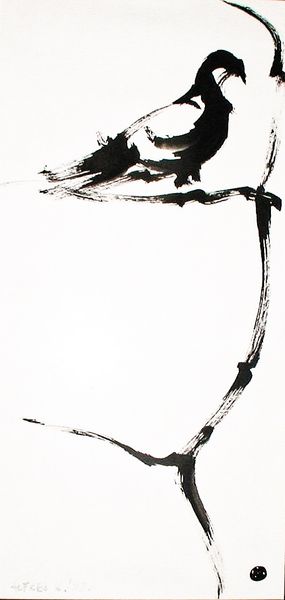
Waichi Tsukata made this print, sometime around 1960, with ink on paper. What strikes me is the sense of immediacy; you can see the artist's hand so clearly in the bold, confident strokes. The textures in ‘Contrast’ range from the solid, opaque black of the lower mass to the delicate, almost transparent grey washes above. Look at the way the ink splatters and bleeds into the paper. It's as if Tsukata is capturing a fleeting moment, a burst of energy frozen in time. The thick, gestural lines feel spontaneous, like a dance across the surface. The layering of the different kinds of marks—the drips, the pools, and the streaks—adds depth and complexity, inviting us to explore the materiality of the medium itself. Thinking about other artists who worked with similar approaches to gesture and form, I’m reminded of Franz Kline. But where Kline’s work is often monumental in scale, Tsukata’s feels more intimate, like a personal meditation on the act of creation.
Comments
No comments
Be the first to comment and join the conversation on the ultimate creative platform.
More like this