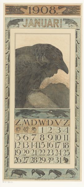
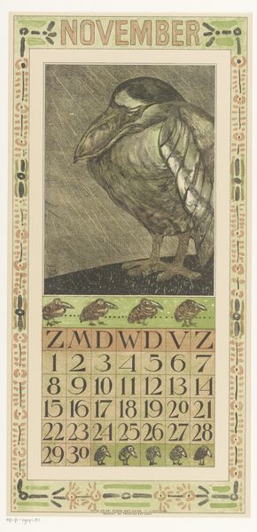
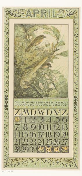
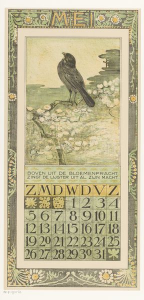
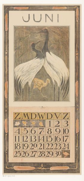
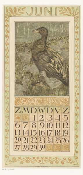
drawing, graphic-art, print, paper, woodcut, poster
#
drawing
#
graphic-art
#
art-nouveau
# print
#
landscape
#
bird
#
paper
#
woodcut
#
symbolism
#
poster
Dimensions: height 440 mm, width 210 mm
Copyright: Rijks Museum: Open Domain
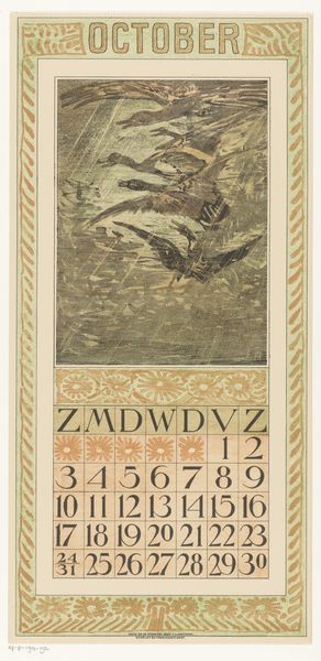
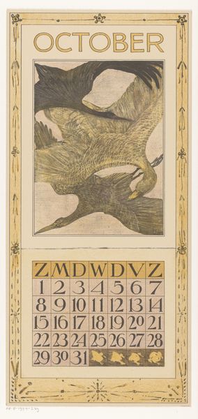
Theo van Hoytema made this lithograph calendar sheet for October at the turn of the century, and it’s a reminder that even the most functional design can be deeply poetic. Look at the bird in flight, wings outstretched, rendered in soft, hazy strokes of green and grey. It’s not a precise depiction, but more like a memory of a bird, seen through a misty window. Van Hoytema’s process feels intuitive, not labored. He lets the stone speak, allowing for a certain looseness. The texture is smooth, almost velvety, which contrasts with the stark geometry of the calendar grid below. Notice how the bird’s wing extends into the space of the calendar, blurring the lines between art and utility. The color palette is subdued, earthy, evoking the melancholic mood of autumn. It reminds me of the prints of Edvard Munch. Like Munch, van Hoytema embraces ambiguity. He understands that art is not about providing answers, but about asking questions, inviting us to see the world in new and unexpected ways.
Comments
No comments
Be the first to comment and join the conversation on the ultimate creative platform.
More like this