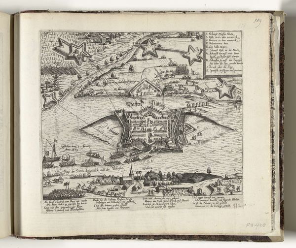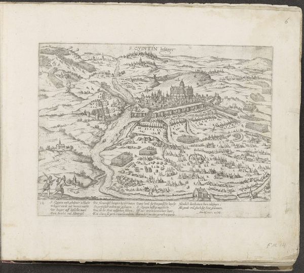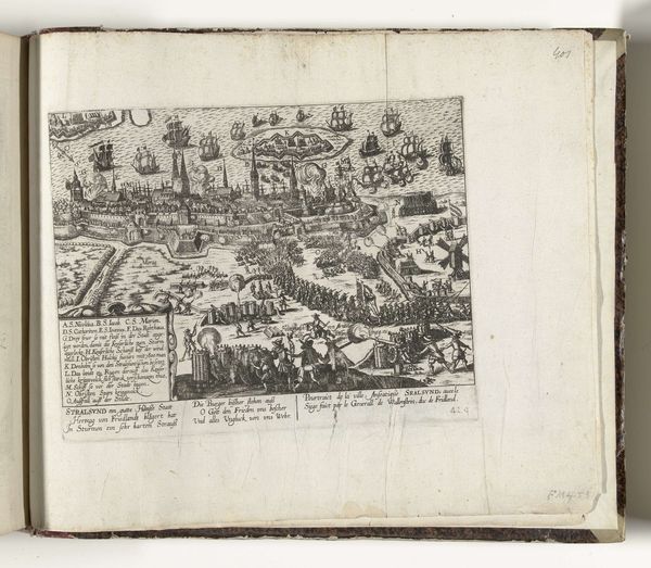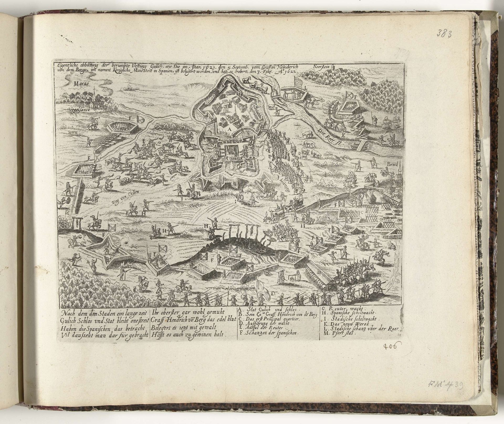
1622 - 1624
Beleg en verovering van Gulik door Hendrik van den Bergh voor de Spanjaarden, 1622
Frans Hogenberg
1540 - 1590Location
RijksmuseumListen to curator's interpretation
Curatorial notes
Editor: Here we have Frans Hogenberg’s “Siege and Conquest of Gulik by Hendrik van den Bergh for the Spaniards, 1622," a print from somewhere around 1622 to 1624. The level of detail is striking; it almost feels like a chaotic but meticulously arranged map. What visual elements do you find most compelling here? Curator: Formally, the composition's effectiveness arises from its layering. Notice the sharp foreground contrasts with the distant cityscape's delicate lines. The strategic placement of textural variations – dense clusters of figures versus the smooth expanse of the river – creates a visual rhythm. Editor: It's true, the texture guides the eye through the whole scene. The sheer busyness is something to behold. I guess this directs our attention to what’s going on… Curator: Precisely! The artist organizes narrative chaos into comprehensible spatial arrangement. Think how line weight contributes to the legibility. See the strategic use of dark lines to articulate foreground forms and lighter etching defining background elements? Semiotically, each distinct stroke operates almost as a linguistic sign, a codified indicator in the visual system that reveals function, location, material and action, offering structured informational access to what would otherwise be a frenzied scene. The tension inherent within these binary oppositions produces clarity out of potential confusion, in essence offering both form and formlessness, clarity and chaotic visual stimuli, peace in division. Editor: That’s fascinating. So it’s the artistic management of opposing forms that actually constructs meaning? Curator: Precisely. Visual syntax dictates how viewers perceive the illustrated conflict and city. Compositional and textural differences are not mere adornments, but rather critical visual cues which construct clarity within the siege's representation. Editor: This piece appears much more calculated now. I've discovered it has complexities beyond a historical depiction. Curator: Indeed. Examining Hogenberg’s technical skill shows that it functions as both artifact and an argument regarding seeing as understanding during conflicts.