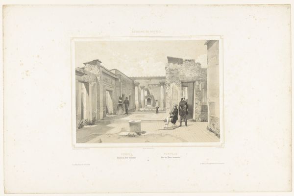
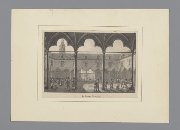
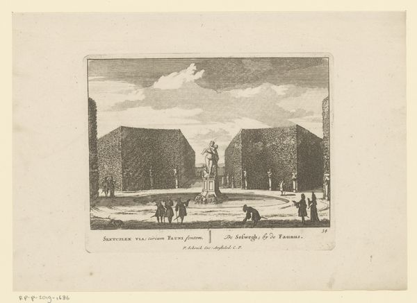
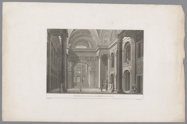
Gezicht op de binnenplaats van de Beurs van Hendrick de Keyser in Amsterdam 1838 - 1879
print, engraving
dutch-golden-age
old engraving style
cityscape
history-painting
engraving
Dimensions: height 146 mm, width 176 mm
Copyright: Rijks Museum: Open Domain
Editor: Here we have Augustin Taurel's "Gezicht op de binnenplaats van de Beurs van Hendrick de Keyser in Amsterdam," an engraving that dates sometime between 1838 and 1879. The architecture feels so grand and stately, even in this monochrome rendering. How do you approach an image like this, focusing on its formal elements? Curator: A captivating print indeed. One is immediately struck by the deployment of line. Note the fineness and precision of the hatching and cross-hatching. Consider how the artist utilizes these techniques to create a sense of volume and depth. What effect does the artist achieve using those formal qualities? Editor: It's like the architecture becomes almost tangible. The high contrast gives a powerful sense of depth within a limited palette. It makes the space appear vast and imposing. Curator: Precisely. And what of the composition? Observe how the artist uses the strong vertical lines of the columns to divide the space, creating a rhythm. It's almost like a stage set, framing the activity within. Editor: I see what you mean. The arches also act like repeating frames, drawing the eye deeper into the courtyard. It feels staged but it still seems natural. Is that even possible? Curator: Indeed, the success lies in the masterful handling of perspective, the creation of receding space, combined with a strategic deployment of shadow to create pockets of visual interest, lending a sense of immediacy despite the controlled, architectural setting. I'm intrigued about your comment about natural... Editor: Okay, I just notice how skillfully he merges geometry and realism; how those stark formal components manage to still look like actual figures, light, and buildings. Curator: An excellent observation. It is a delicate balance between structural integrity and representational fidelity that lends the print its particular potency. Editor: It definitely gives me a new appreciation for the detail and deliberation within monochrome prints like this one! Thank you.
Comments
No comments
Be the first to comment and join the conversation on the ultimate creative platform.