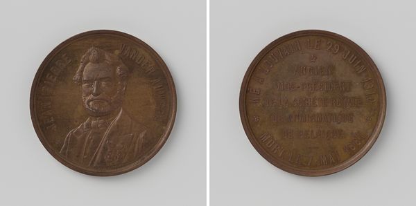
relief, bronze, sculpture
#
portrait
#
sculpture
#
relief
#
bronze
#
sculpture
#
romanticism
#
carved
#
history-painting
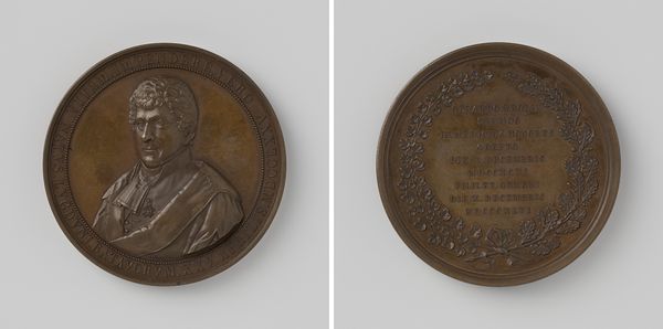
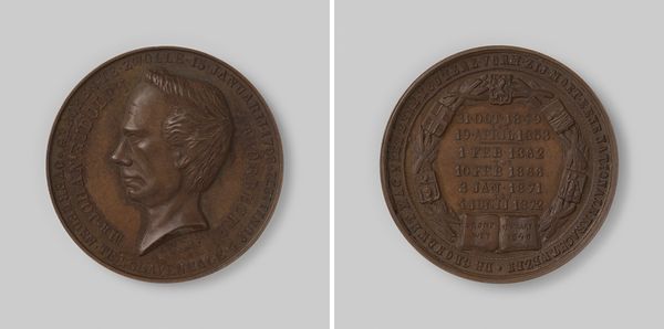
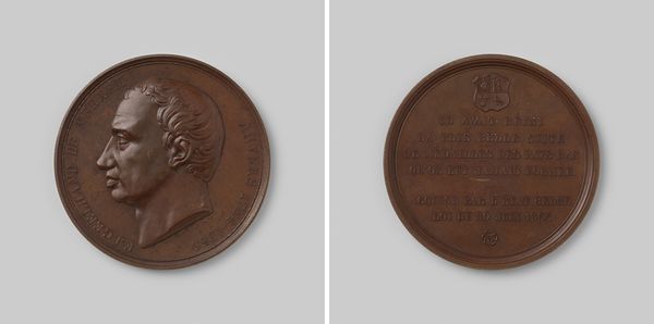
Dimensions: diameter 5.1 cm, weight 85.14 gr
Copyright: Rijks Museum: Open Domain
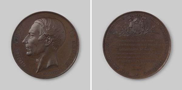
Editor: We’re looking at "Overlijden van C.J. Rouget de Lisle, schrijver van de Marseillaise, 1836", a bronze relief sculpture created in 1843 by Emile Rogat. It strikes me as interesting how a death is memorialized on a coin-like object. What catches your eye, looking at its structure? Curator: The duality is immediately apparent; observe the juxtaposition of the two sides. The portrait, crisply defined, stands in stark contrast to the dense field of text. Consider the material, bronze, typically used for commemoration, here serving as a canvas for both image and script. Does the density of the text inform your understanding of the portrait on the other side? Editor: It does make the portrait stand out more, actually. The text seems to be functioning almost like a frame. Is the contrast intentional, do you think? Curator: The deliberate contrast invites us to consider the relationship between the individual and the narrative, the face and the legacy. Notice how the incised text captures light, almost shimmering, while the relief portrait possesses a more grounded, three-dimensional quality. Does this differentiation guide your gaze, directing your attention to one side over the other? Editor: I find my eye drawn more to the portrait first, then the writing. It’s like the sculpture is asking you to recognize the person first and then the impact. Curator: Precisely. The artist uses these formal devices to construct a dialogue between the man and his deeds, compelling us to decipher the intricate interplay of form and content. How might our perception shift if the textures were reversed, and the portrait were presented as an inscription instead? Editor: I think that might make it feel less personal, more like an official document. This layout gives it a certain… intimacy, even if it is about a public figure. Thank you, that has helped me see much more in this relief than I did initially. Curator: And it's through precisely such close observation that we discover how form articulates and shapes meaning.
Comments
No comments
Be the first to comment and join the conversation on the ultimate creative platform.
More like this