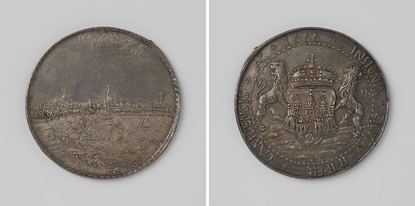
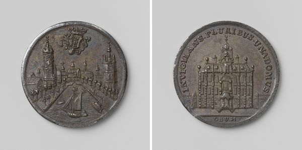
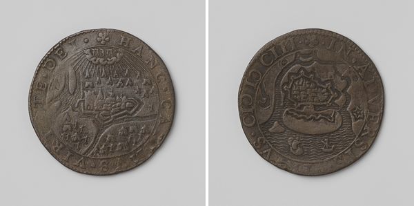
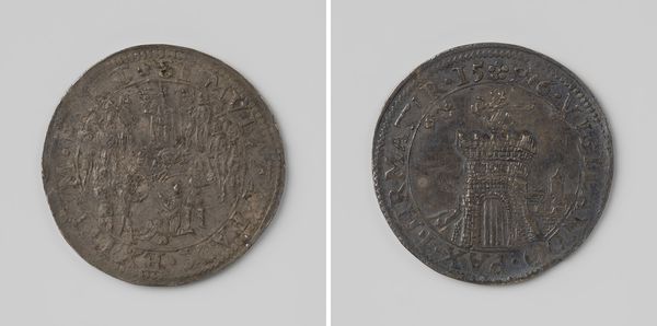
Viering van de kroning van Willem III en Maria te Rotterdam, penning geslagen op last van het stadsbestuur van Rotterdam 1689
romeyndehooghe
Rijksmuseum
metal, relief, sculpture
baroque
metal
sculpture
relief
sculpture
history-painting
Dimensions: diameter 3.2 cm, weight 9.47 gr
Copyright: Rijks Museum: Open Domain
Editor: This is a metal coin from 1689, titled *Viering van de kroning van Willem III en Maria te Rotterdam*, which translates to *Celebration of the coronation of William III and Mary in Rotterdam*. It was designed by Romeyn de Hooghe and is currently housed in the Rijksmuseum. The surface has an interesting tactile quality. What is striking to you about its formal qualities? Curator: Immediately, I notice the contrasting modes of representation on each face. The city view on one side is more naturalistic, utilizing depth and perspective, though stylized, of course. While the other face presents the coronation in an architectural setting. What principles of composition do you observe governing each of these sides? Editor: Well, the cityscape feels expansive, almost panoramic, while the coronation scene feels very compressed, almost claustrophobic, despite the architectural setting. Curator: Precisely. Note also how the coin’s circular format impacts how our gaze travels across each scene. Does the artist utilize that curvature effectively or is it arbitrary? Look, too, at the placement of the text; notice how it frames and reinforces key visual elements in both scenes. Editor: I see what you mean! On the coronation side, the phrase “FELICIT PATRIAE QUE” curves above the figures, like an inscription on a triumphal arch, and grounds the figures underneath. And on the Rotterdam side the phrase "NOVA REDIVIDA" curves around and supports the city seal. Is the division and ordering purely decorative, or do you think it introduces a visual argument of sorts? Curator: It creates a symbolic structure which then allows a viewer to interpret each image by its orientation. I am compelled to notice the palm tree, the lines converging and emanating toward its trunk. Notice the crest symbols. I wonder whether the crest should be seen as the coin's formal center and grounding point. Editor: Interesting. Considering the structural elements alone does bring forth new avenues for visual analysis and thus for interpretive opportunities. Curator: Absolutely, a purely visual language gives us clues to a grander narrative.
Comments
No comments
Be the first to comment and join the conversation on the ultimate creative platform.
More like this