#
aged paper
#
toned paper
#
homemade paper
#
experimental typeface
#
typeface
#
abstract
#
fading type
#
stylized text
#
golden font
#
watercolor
#
historical font
Copyright: Public Domain: Artvee
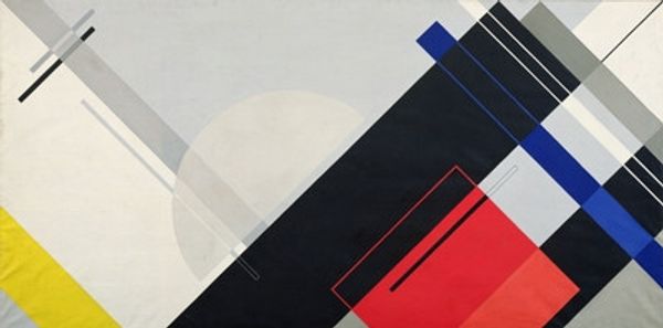
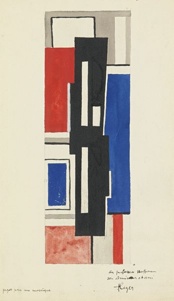
László Moholy-Nagy made this ‘Komposition’ using what looks like watercolor, or maybe gouache – it’s giving me a sense of process, a kind of building up of layers. There’s something about the way he's handled the paint here, it’s so thin, almost transparent. You can see the texture of the paper underneath, like the image is barely there at all. That red line, running diagonally across the bottom, is particularly interesting. It’s so precise, so deliberate, cutting through the softer, more amorphous shapes above. I love how he’s juxtaposing these hard-edged geometric forms with this fluid, washy ground, but it is more than just the geometric shapes. Moholy-Nagy was really interested in exploring new ways of seeing and representing the world, like his contemporary El Lissitzky. And you know, art isn't about having all the answers but asking interesting questions and experimenting with the possibilities.
Comments
No comments
Be the first to comment and join the conversation on the ultimate creative platform.
More like this