Copyright: Gregoire Boonzaier,Fair Use
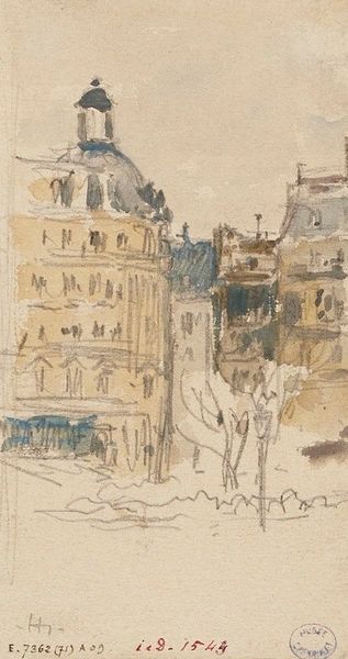
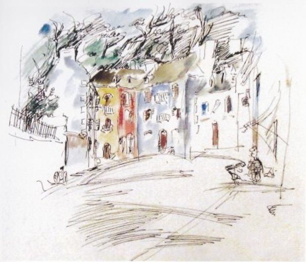
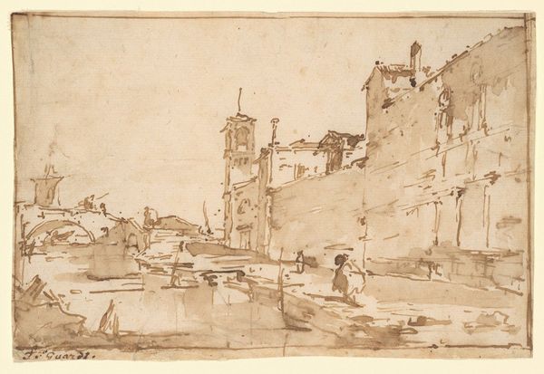
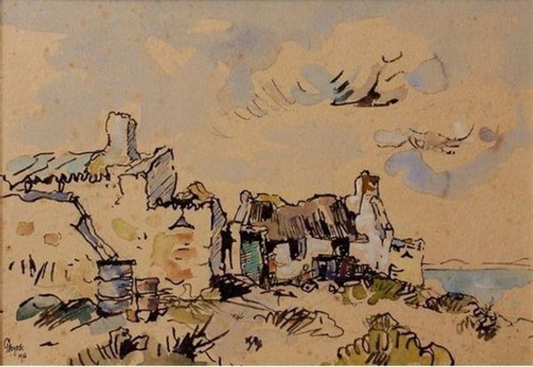
Gregoire Boonzaier made this ‘Cape Street Scene’ with ink and watercolour, and it feels like he really relished the process. There’s a real sense of immediacy about the work, the textures are raw. Look at how the diluted ink pools and feathers on the page, creating a rich variety of tone and texture. The buildings are defined with quick, decisive strokes, almost like shorthand. Boonzaier’s use of colour is sparse but effective, drawing the eye to certain areas and creating a sense of depth. In the center of the frame, there’s a building with a cupola. Its rendered with just a wash of blue and gray. These soft, muted tones contrast with the more saturated washes elsewhere and suggest the hazy distance. This emphasis on process and materiality reminds me of work by Marlene Dumas, another South African artist, in that both invite us to really feel their process. Ultimately, Boonzaier's work embraces a beautiful ambiguity, offering not a fixed image but a space for our own interpretations and reflections.
Comments
No comments
Be the first to comment and join the conversation on the ultimate creative platform.
More like this