drawing, graphic-art, print, ink, engraving
#
drawing
#
graphic-art
#
baroque
#
pen drawing
# print
#
ink
#
geometric
#
decorative-art
#
engraving
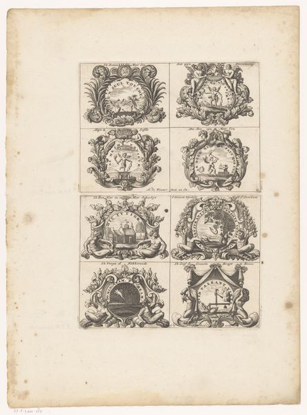
Dimensions: height 350 mm, width 450 mm
Copyright: Rijks Museum: Open Domain
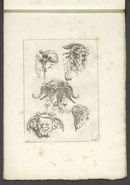
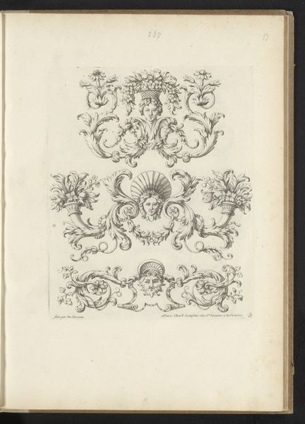
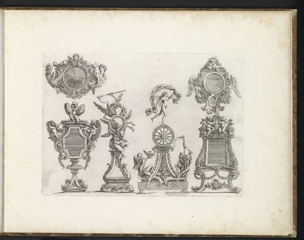
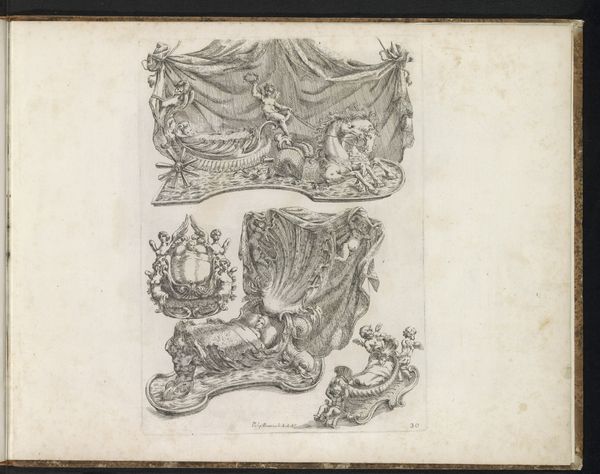
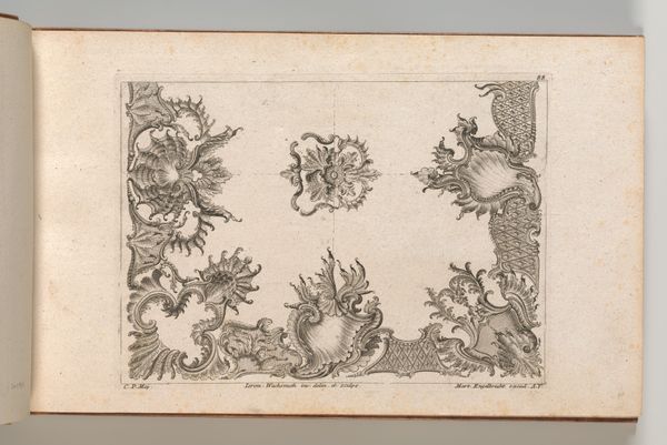
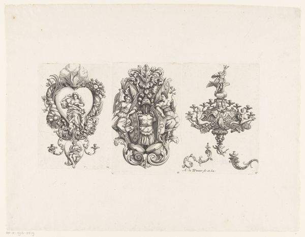
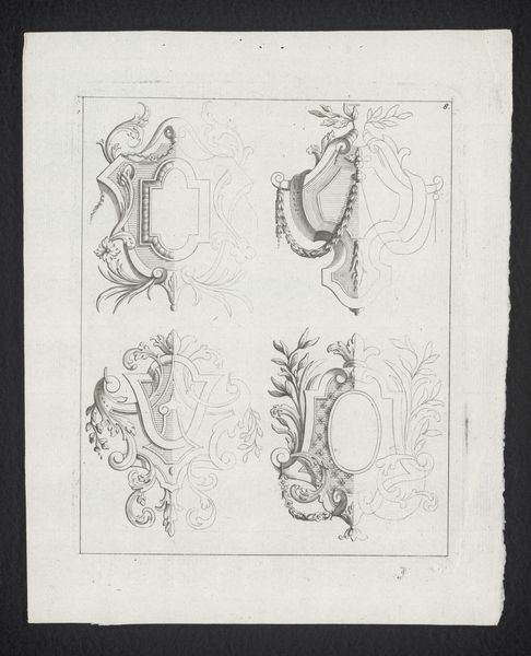
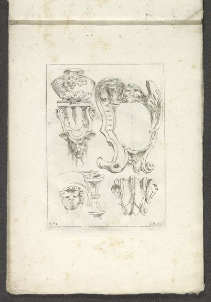
Curator: Here we have Filippo Passarini's "Acht ontwerpen voor cartouches," created around 1698. These eight designs for cartouches are rendered in ink, through engraving and drawing techniques. My immediate impression is of intricate, delicate precision. Editor: Precision, yes, but also extravagance! The Baroque loved to show off, didn’t it? The ornamentation here is dizzying – crowns, tassels, cherubs, swirling acanthus leaves – all crammed around those central monograms. It almost overwhelms the basic geometric form. Curator: Indeed. These cartouches weren't just decoration; they were potent symbols of status and authority in late 17th-century European society. These designs reflect the elaborate visual language used to project power. We can observe how the Papal regalia and royal crowns communicate hierarchy within European nobility. Editor: Look closely at the engraving itself. Notice the artist's use of hatching and cross-hatching to create a sense of depth and texture. Passarini's understanding of light and shadow truly brings a sculptural quality to something that's ultimately a flat image. I mean, look how those cherubs almost leap off the page! Curator: Absolutely, and consider the broader social function. These designs, though seemingly ornamental, were instruments for social distinction. They served a critical role in how families displayed their heritage, influence, and alliances in a visually compelling manner. This print format enabled distribution and standardized symbolic language. Editor: And what about the purely abstract beauty? Take away the historical context, and you’re left with compositions that are almost purely formal – lines, shapes, and patterns creating visual rhythm. The geometric groundwork overlaid by elaborate design creates this fascinating tension. Curator: It highlights how formal elements and broader cultural statements can work together. Thank you, this exchange brought new levels of appreciation. Editor: I concur! Examining the interaction of line, form, and context revealed much more than initial observation offered.
Comments
No comments
Be the first to comment and join the conversation on the ultimate creative platform.
More like this