print, paper, photography, gelatin-silver-print
#
aged paper
#
still-life-photography
#
paperlike
# print
#
editorial typography
#
personal journal design
#
paper
#
photography
#
gelatin-silver-print
#
publication mockup
#
monochrome
Dimensions: height 128 mm, width 176 mm
Copyright: Rijks Museum: Open Domain
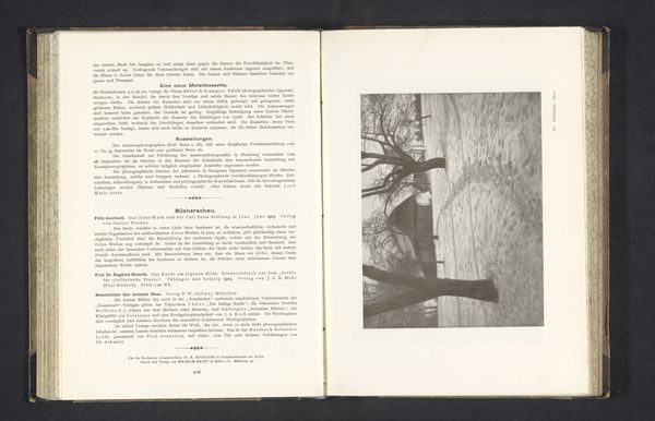
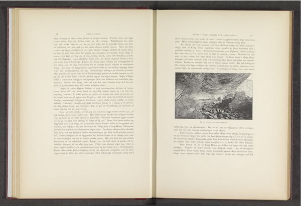
Editor: This is a photograph entitled "Ganzen plukken" by Hildegard Lehnert, dating from before 1903. It's a gelatin-silver print, reproduced here in what appears to be a publication. It's such a detailed, almost journalistic image; what catches your eye? Curator: I am struck by the interplay of textures. Consider the stark contrast between the crisp typography on the left-hand page and the softly blurred photographic image on the right. The image itself contains a fascinating gradient from light to dark, contributing to the overall atmospheric density. What compositional elements can we discern? Editor: The figures appear to be working in a dimly lit interior, possibly a kitchen. There's definitely a strong emphasis on the monochromatic tones. Curator: Indeed. Notice how the arrangement of the figures, while seemingly informal, creates a certain visual rhythm. The strong vertical lines formed by the architecture in the photograph divide the image, creating distinct visual zones within the composition. How does this structuration inform the overall reading of the image? Editor: It adds depth and organizes what might otherwise be a chaotic scene. I can also sense some diagonal lines to move across the image. Curator: Precisely. And note the use of light, the highlights defining form against the shadowed areas; that controlled tonality suggests a carefully considered orchestration of visual elements. The light seems deliberately employed to enhance the photographic object. It directs our focus. Editor: It's interesting how the composition guides the viewer's eye. So many details, meticulously presented and how these lines give rhythm to the composition. Curator: And such rhythm suggests an awareness of design principles, perhaps mirroring period conventions while asserting the inherent qualities of the chosen photographic form. I was overlooking that balance initially. Editor: Thank you! I've noticed elements I never would have without that more measured analysis of line, shadow and layout.
Comments
No comments
Be the first to comment and join the conversation on the ultimate creative platform.
More like this